One stop design shop
Need a new brand identity? 2D/3D animated content for your social media feeds? Illustrations? A 3D product visualisation? A new website? A fine new brochure for that upcoming exhibition? Or maybe your existing brand needs a bit of a facelift and guidelines for video? New brand illustrations? Or maybe we can figure out together what it might be that you need, if you can’t quite put your finger on it.
I’m an extensively experienced, multifaceted art director, designer and solver of visual problems with plenty of hats to switch between.
Reel
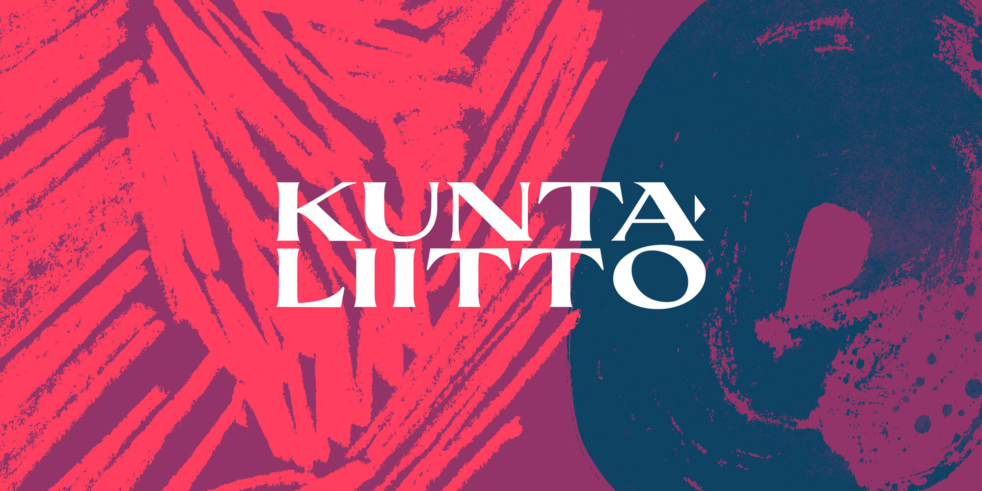
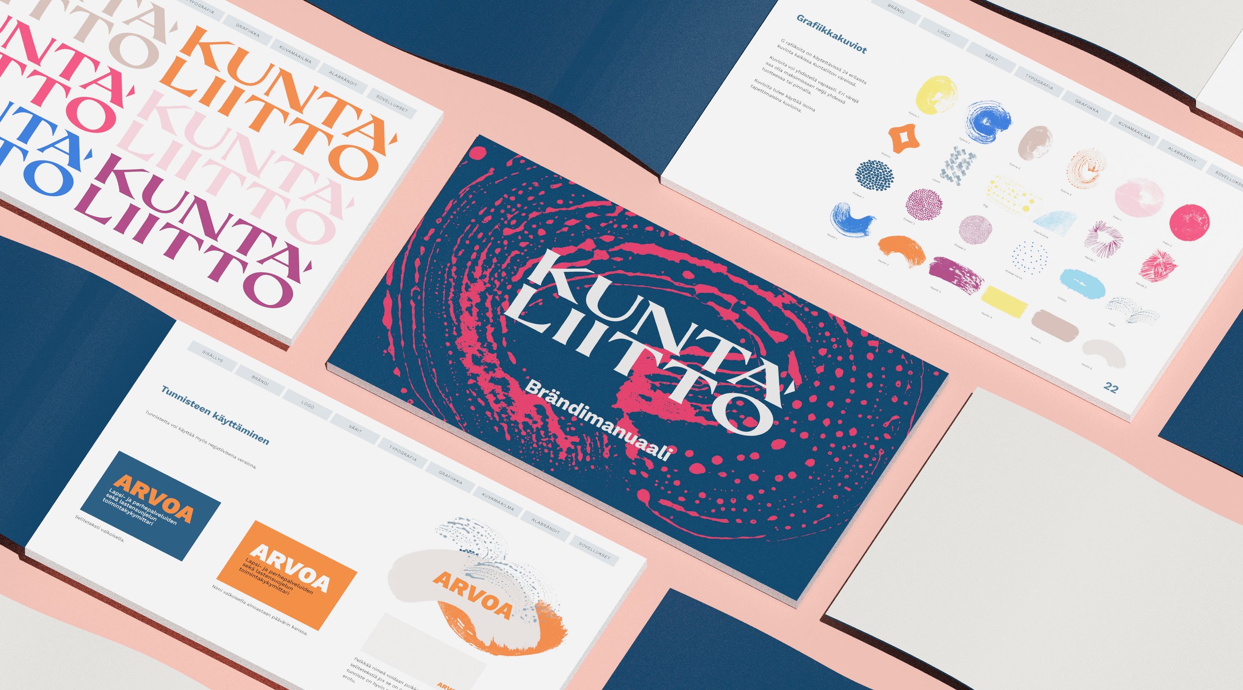
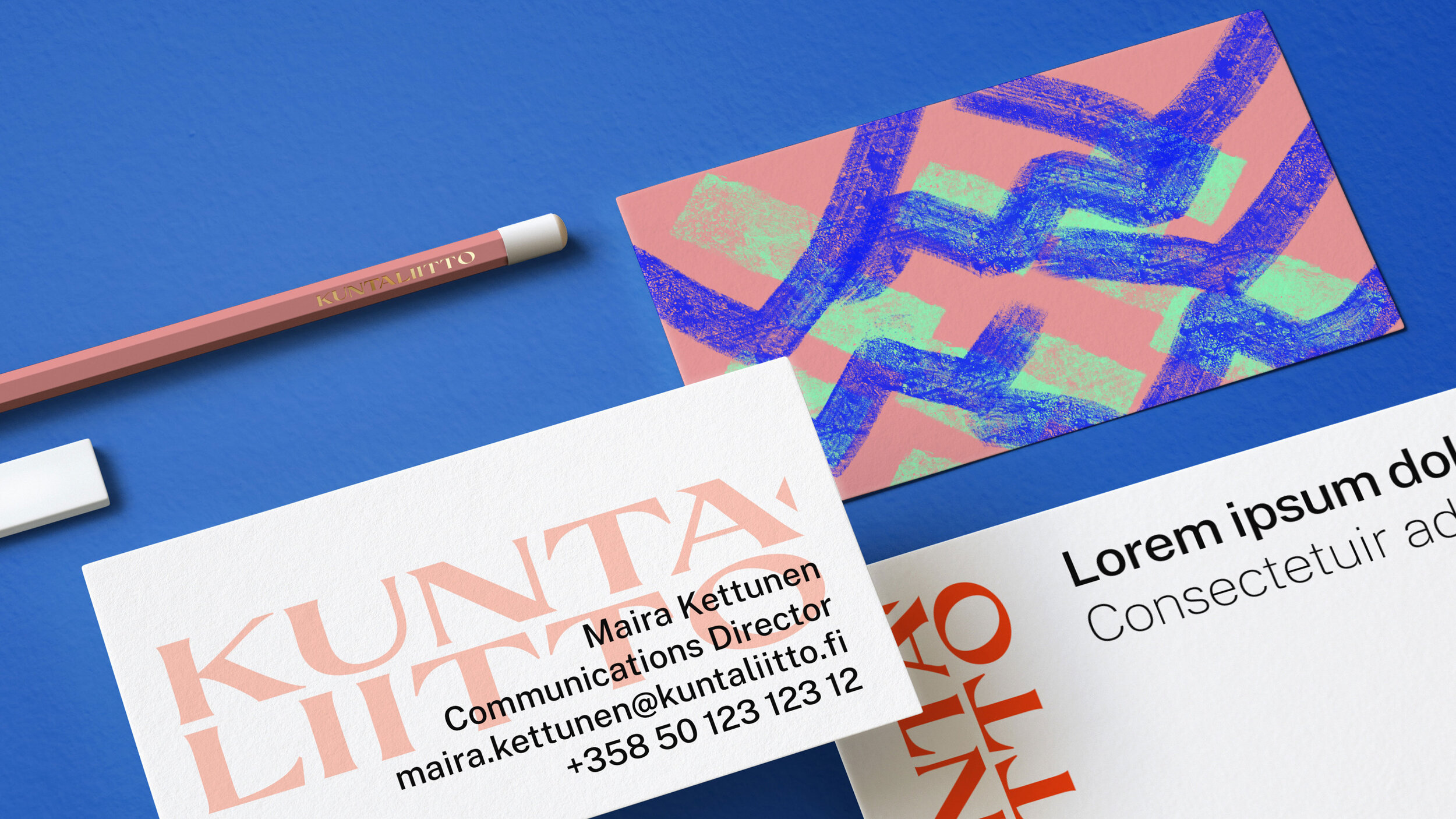
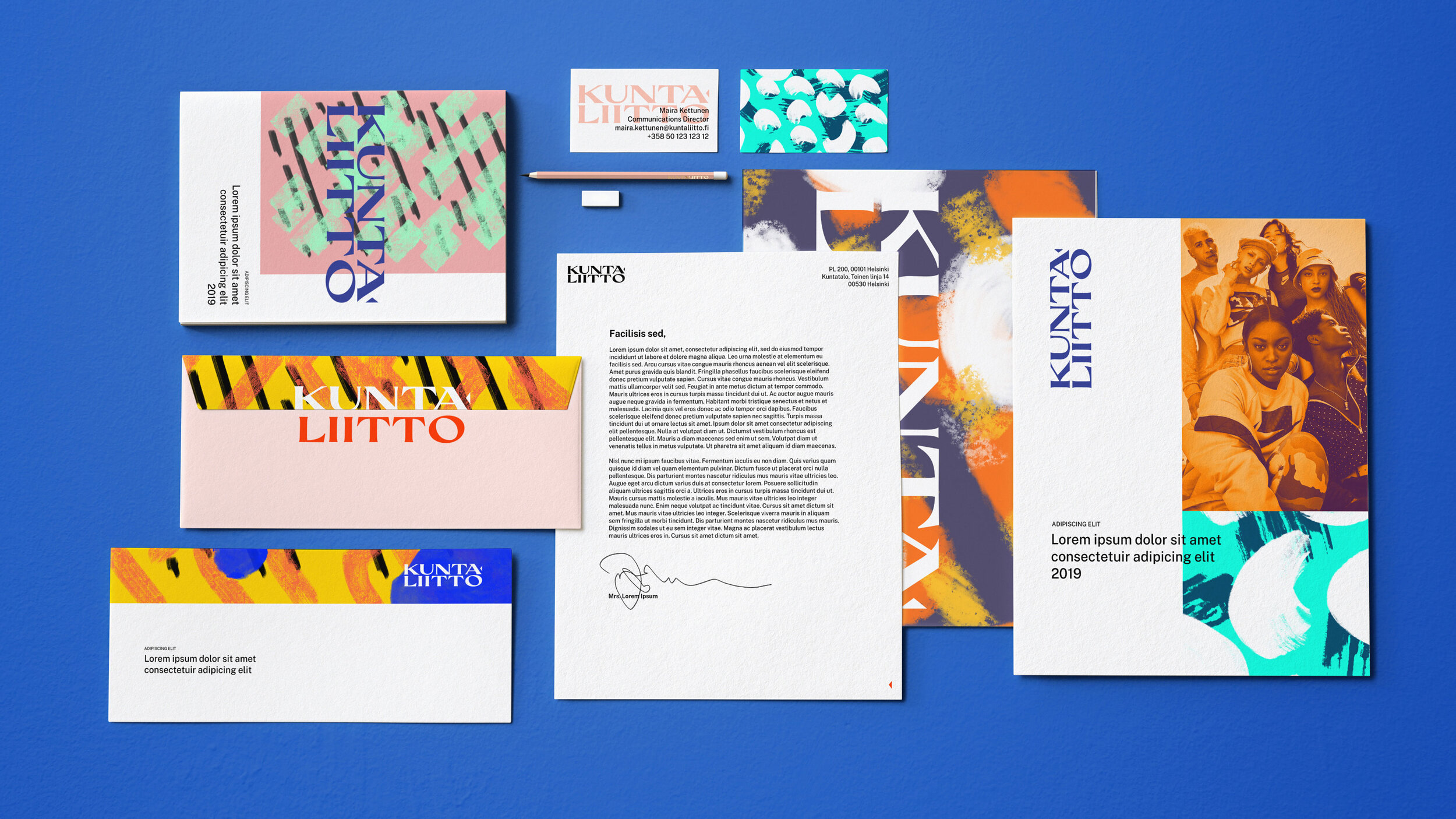
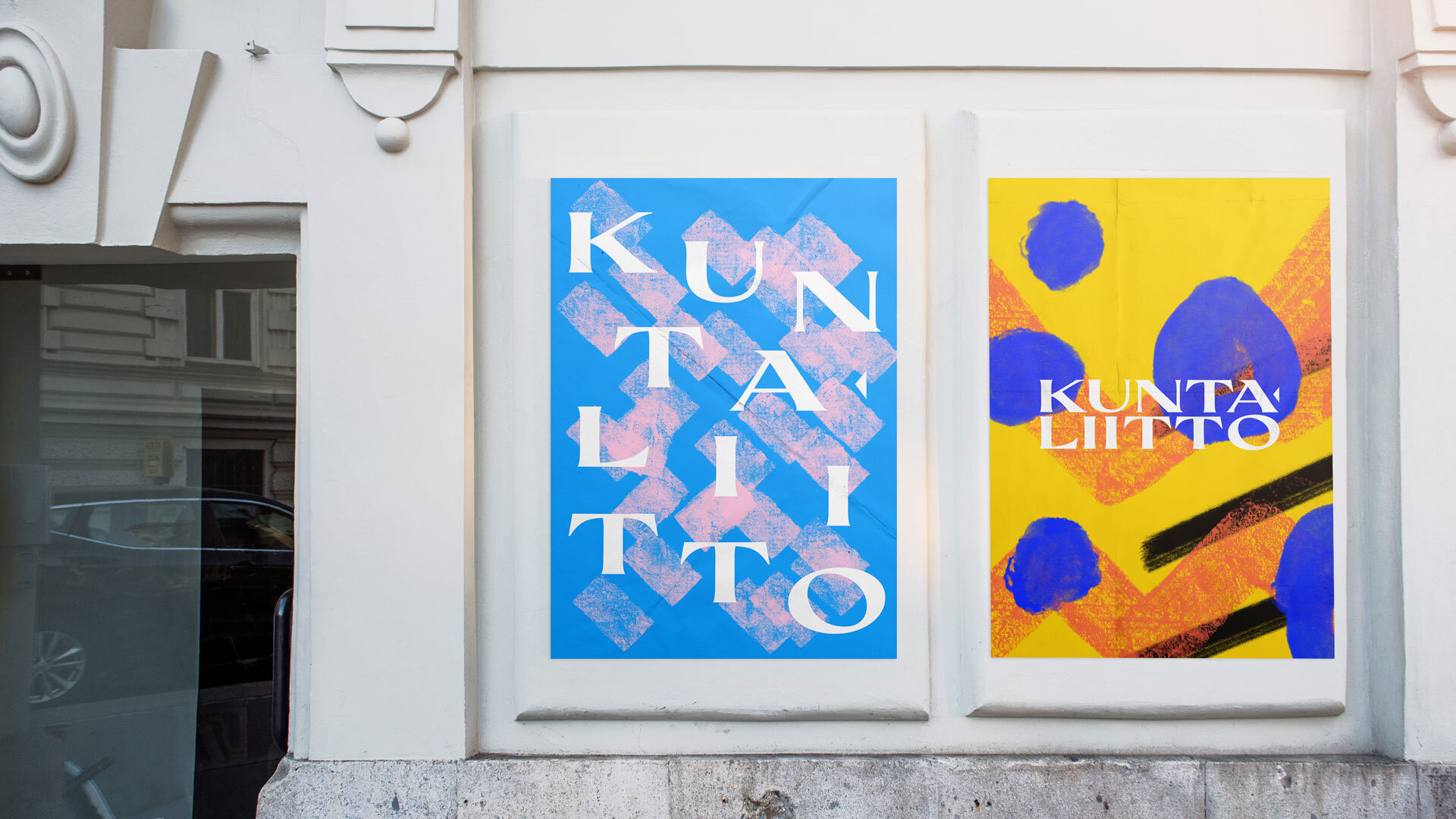
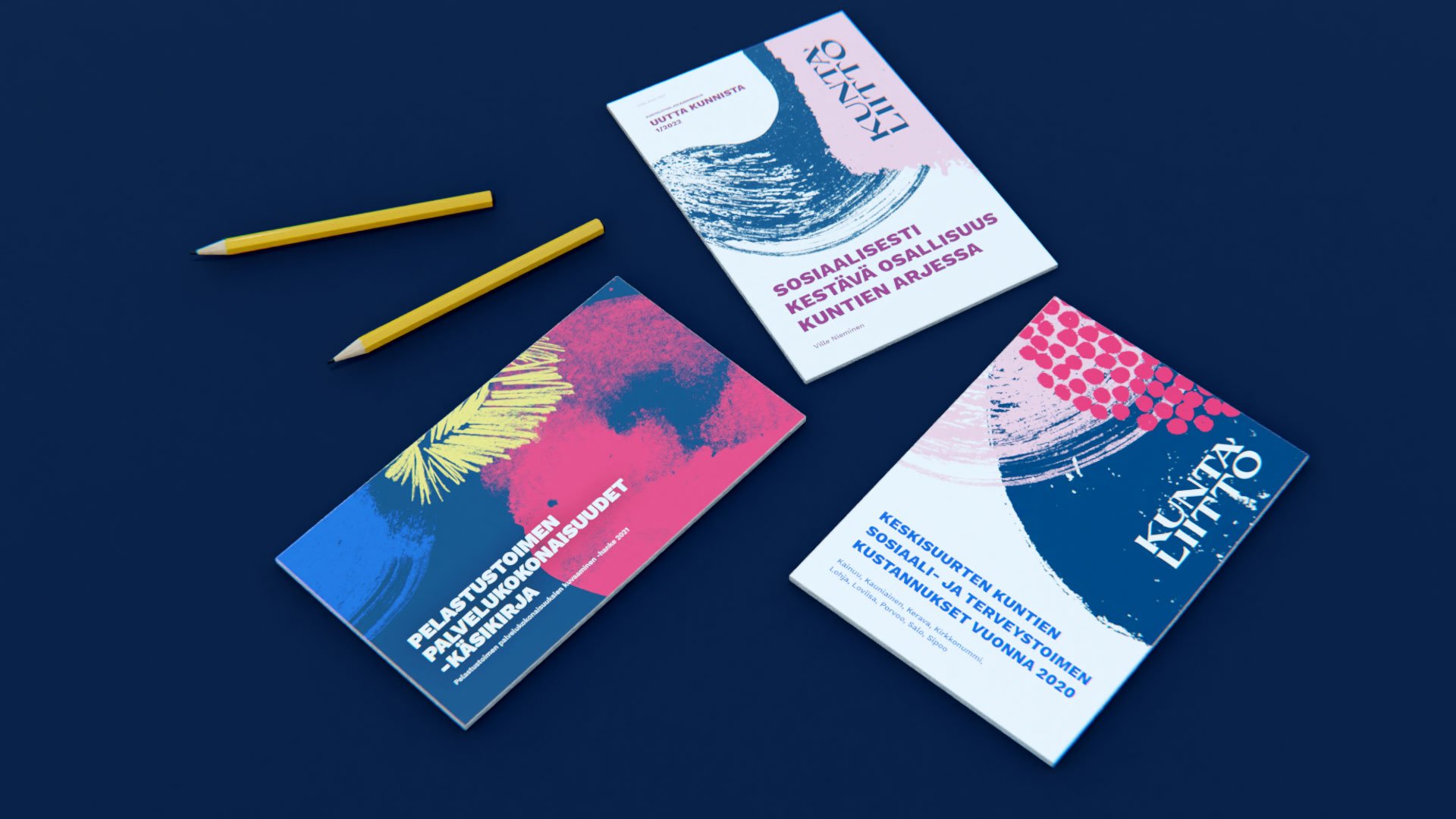
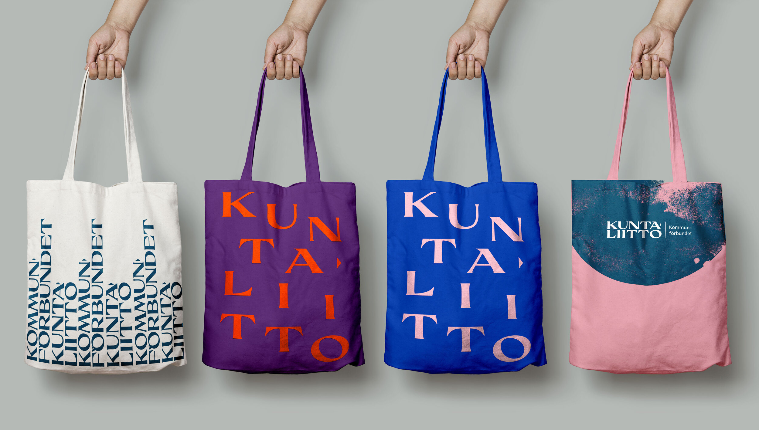
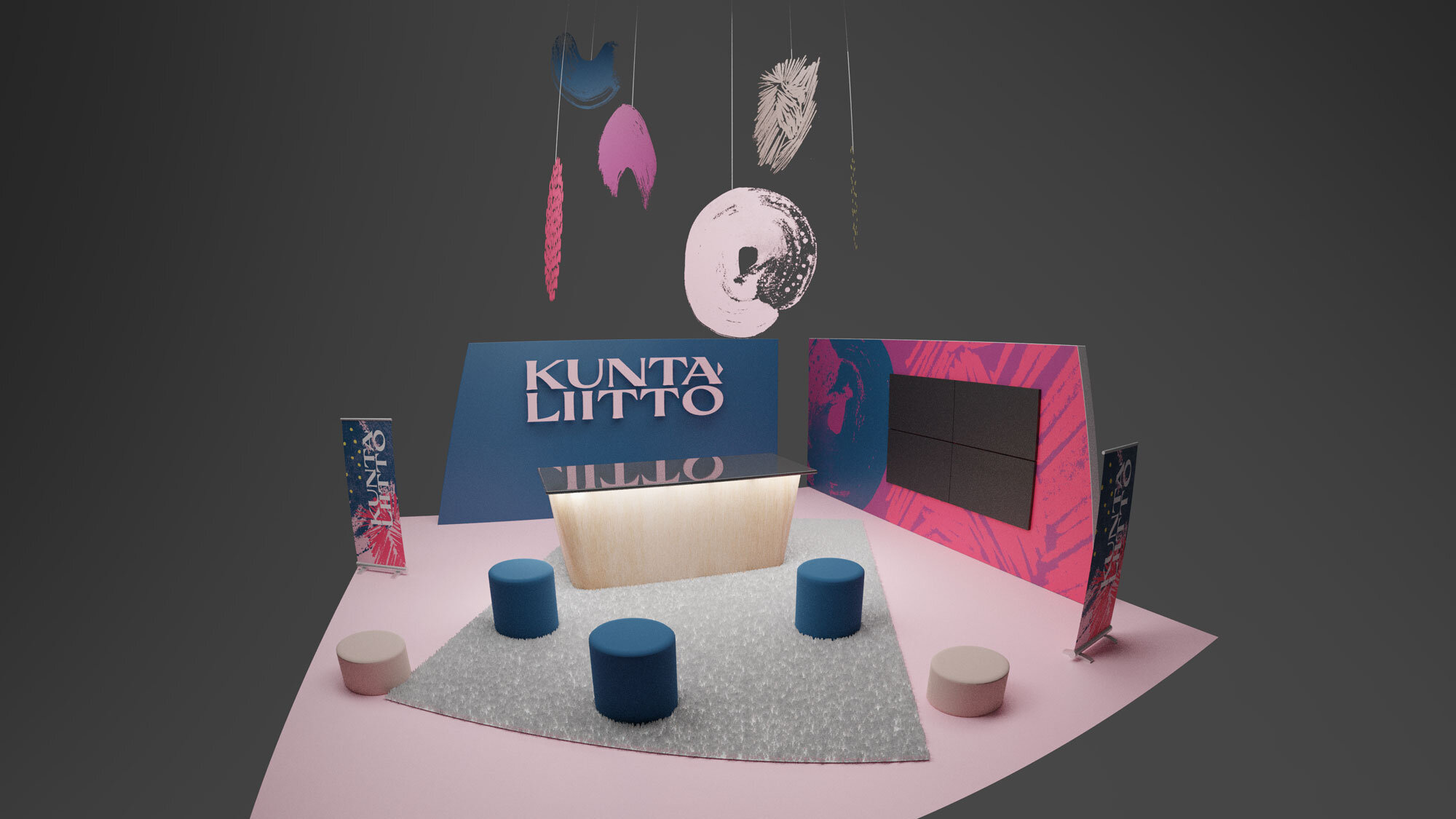
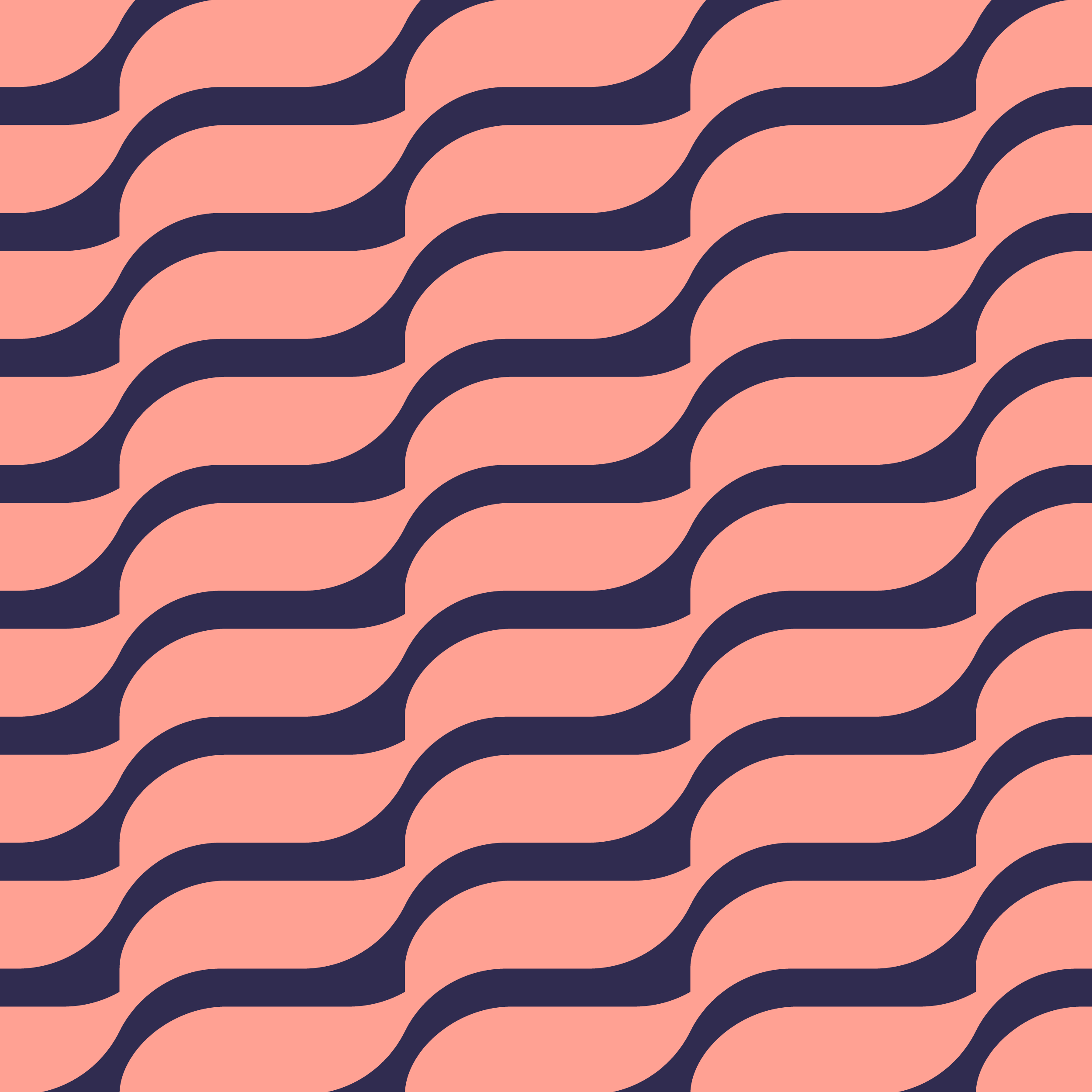
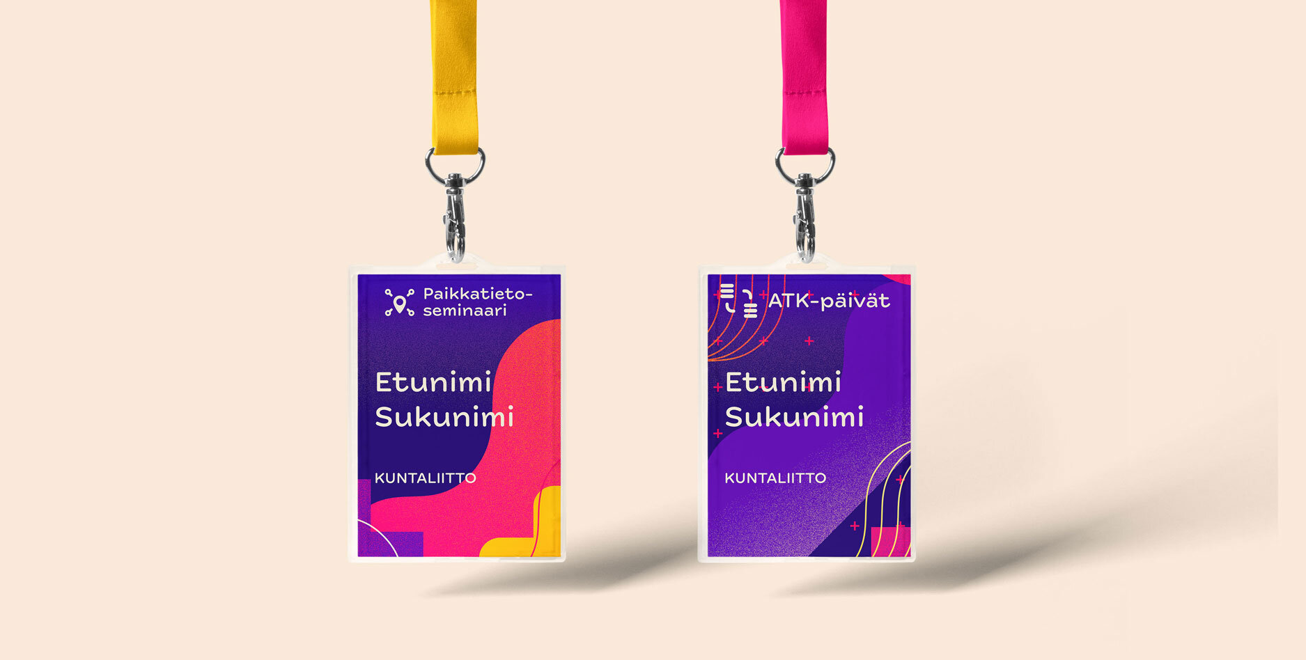
Kuntaliitto
Kuntaliitto (The Association of Finnish Municipalities) wanted to shake off the bureaucratic feel of their old brand and come up with something vibrant and different. I came up with a hand-drawn pattern system (the final version courtesy of Ville Savimaa), a chunky logo, the brand manual, along with the website, exhibition concepts, illustration style & animation concepts, merchandise, and templates to suit their hundreds of publications.
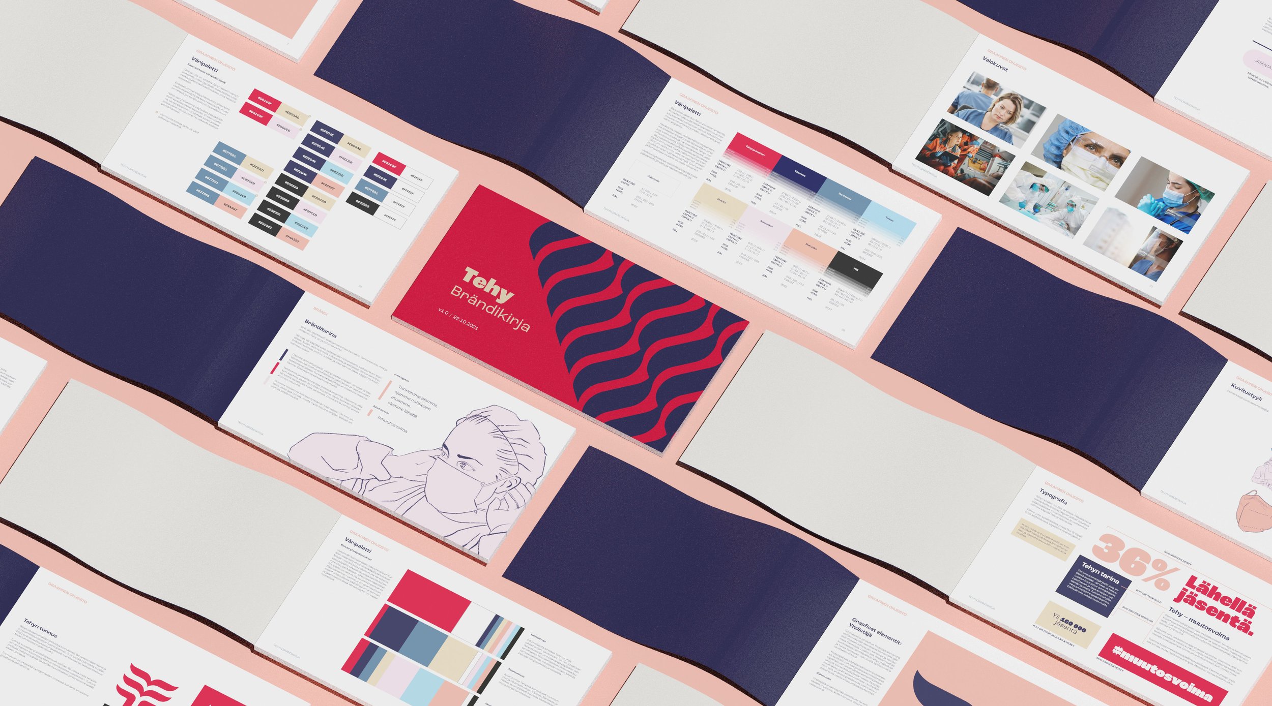
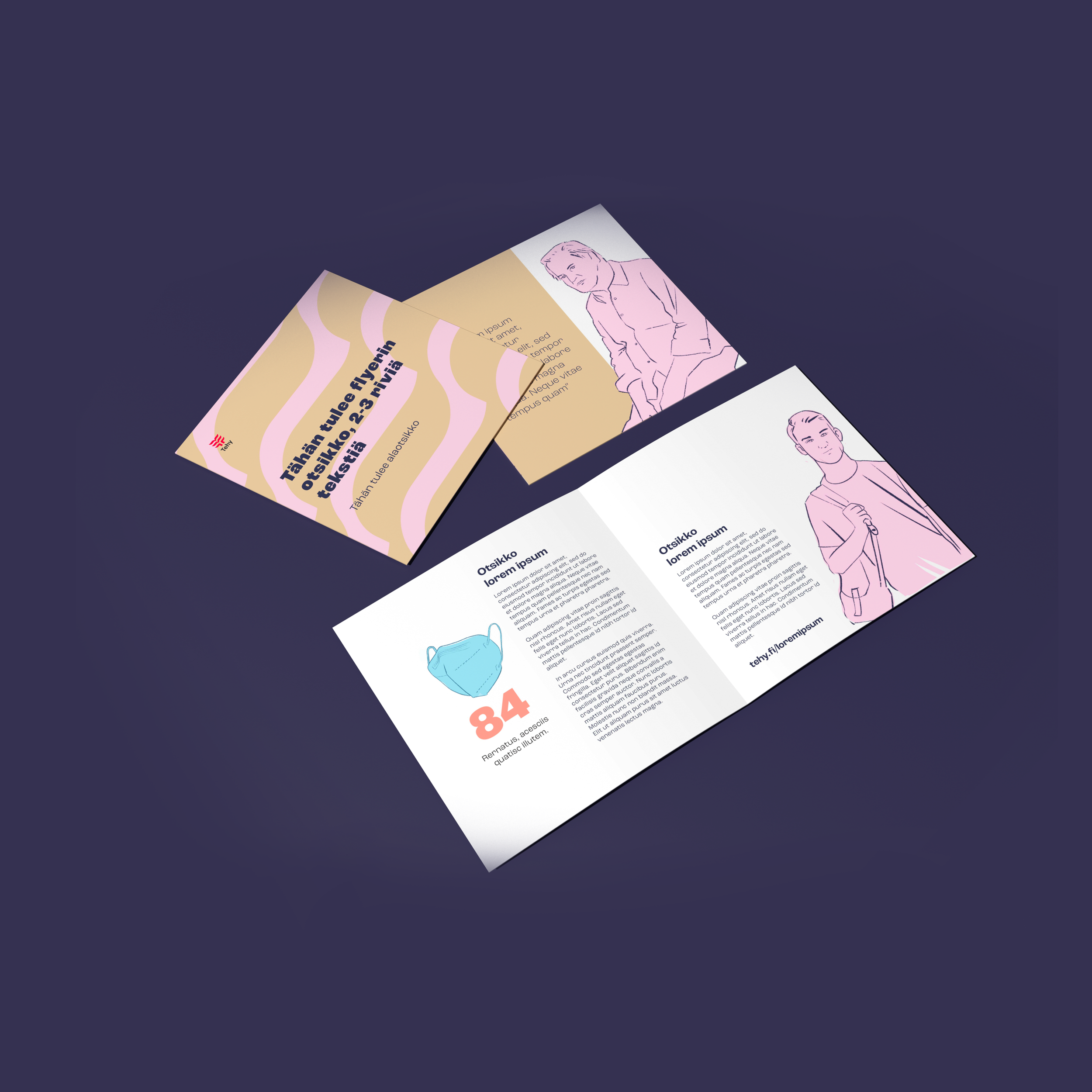
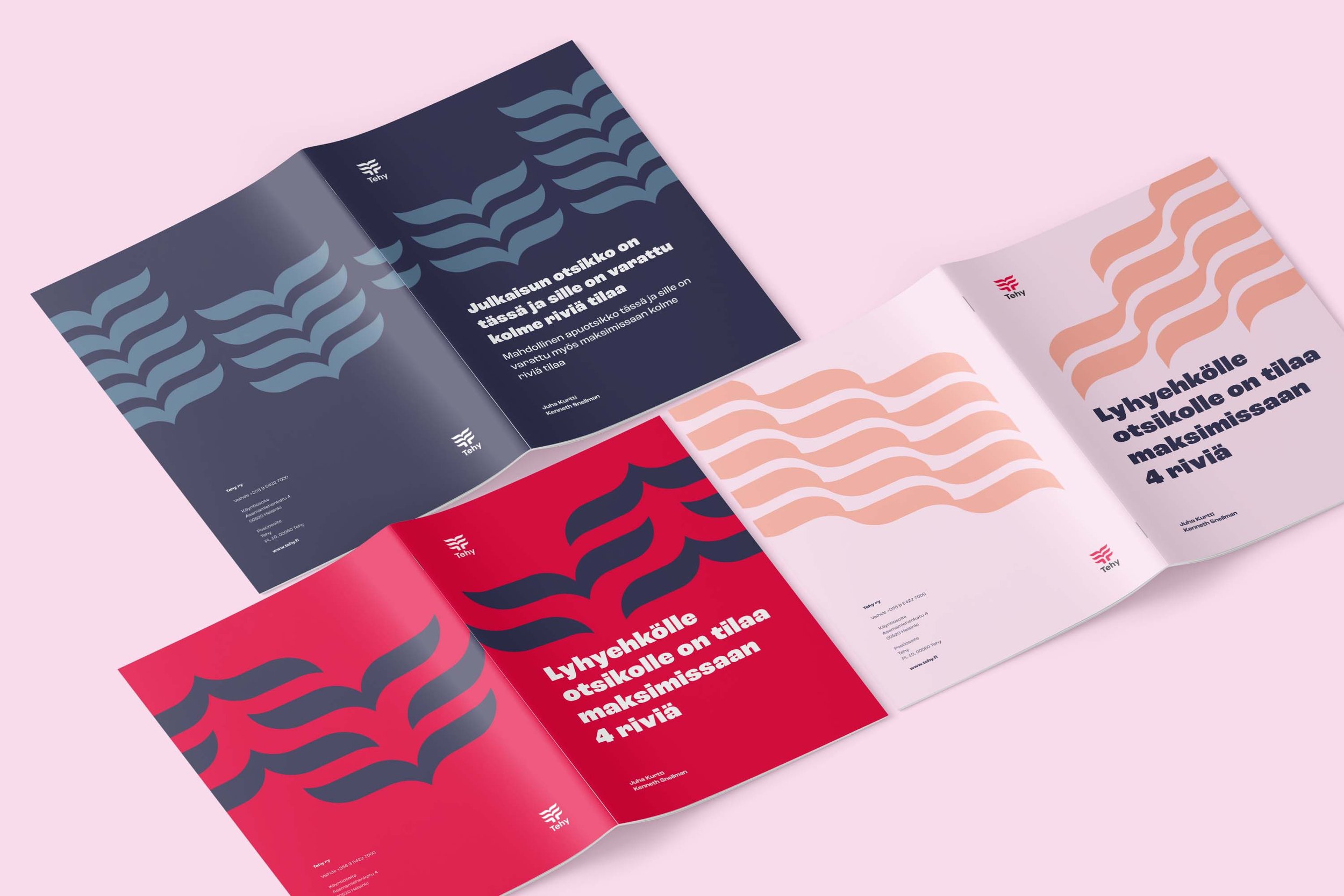
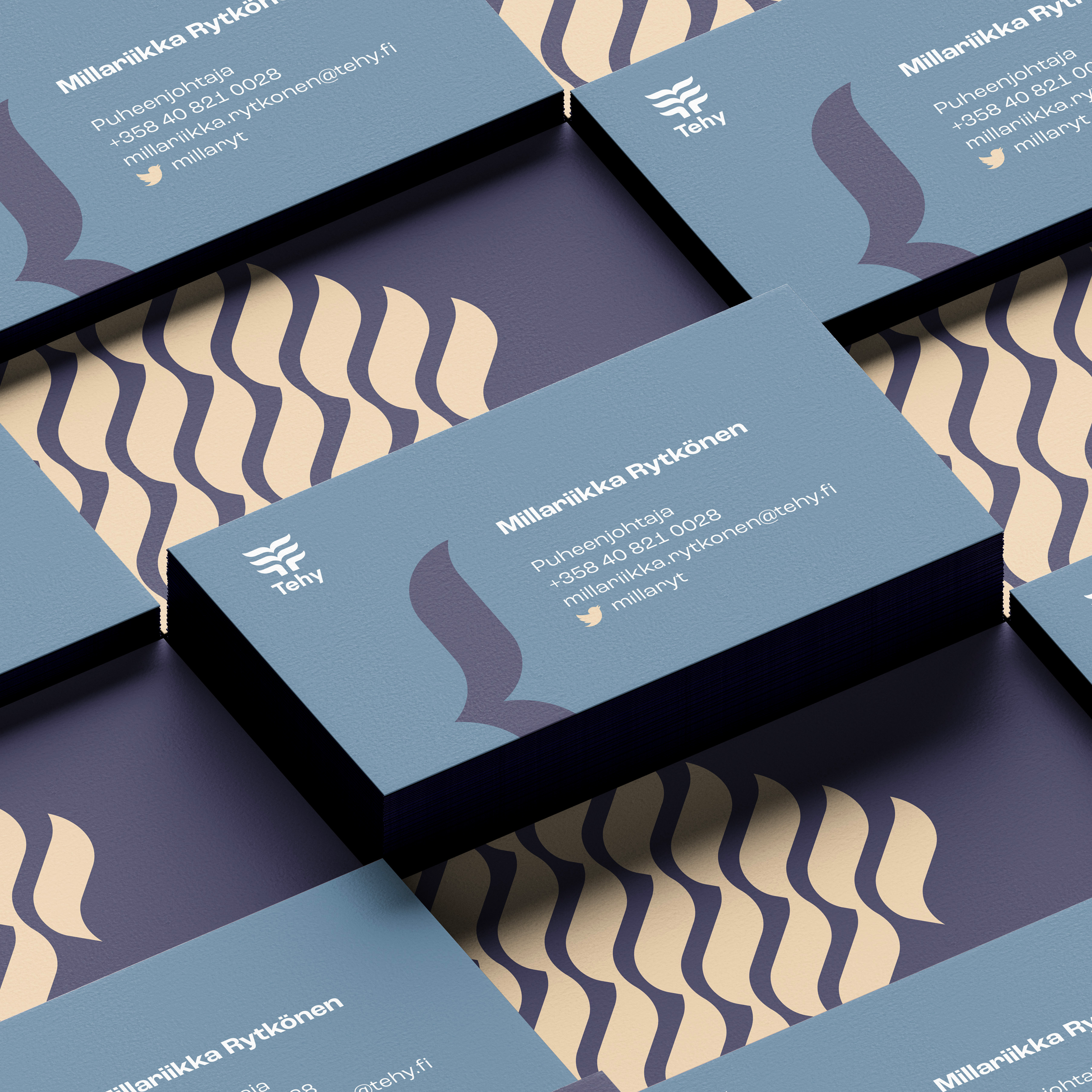
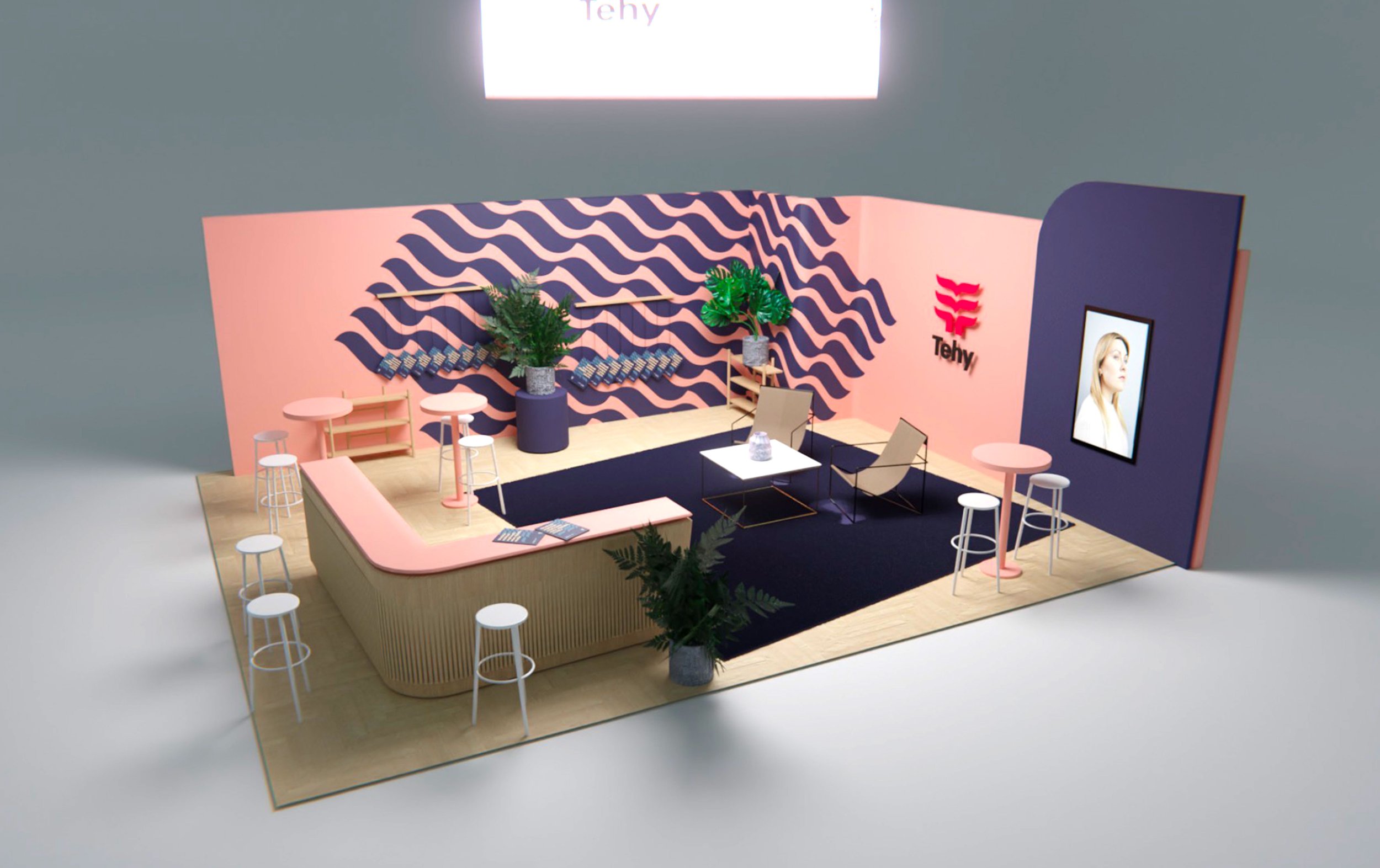
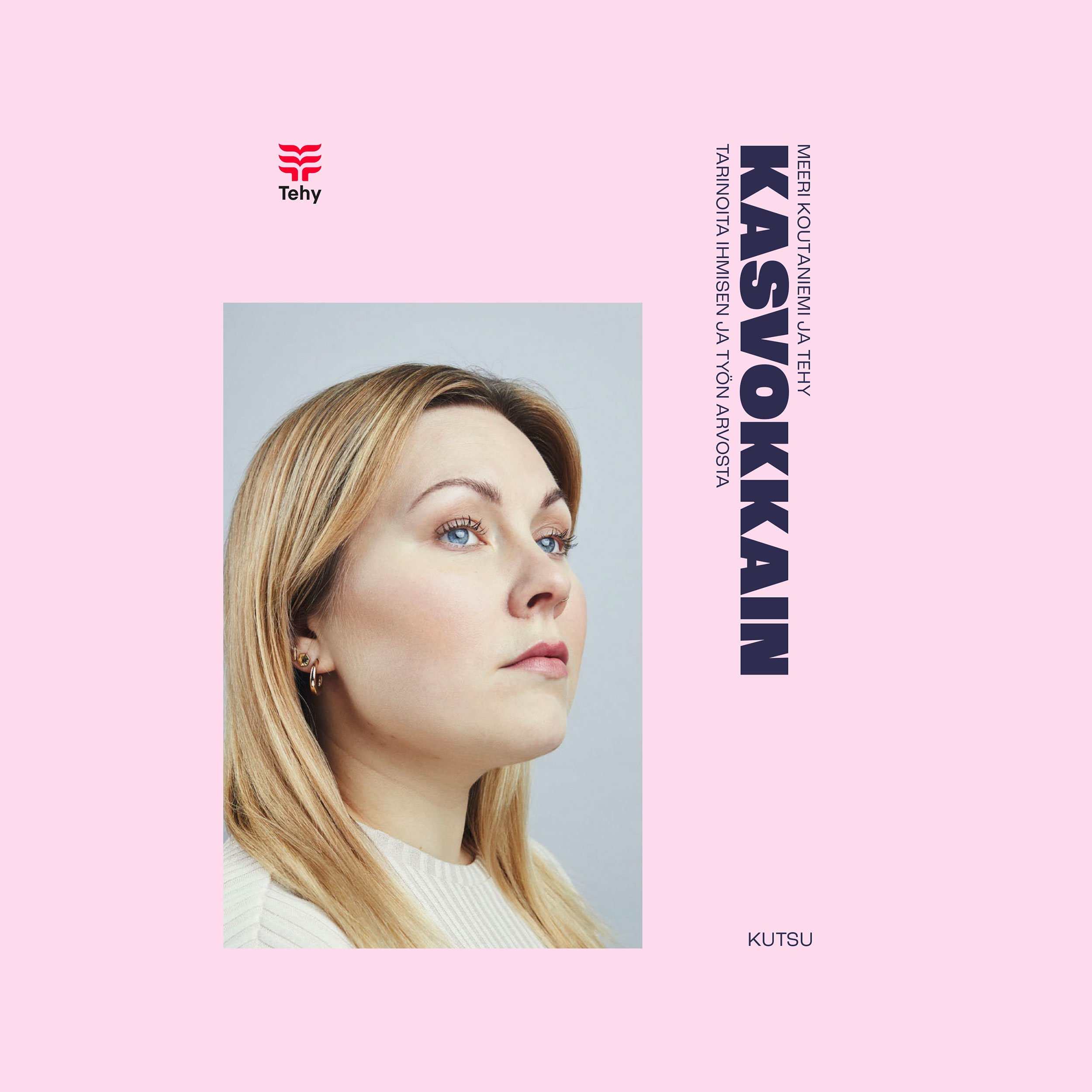
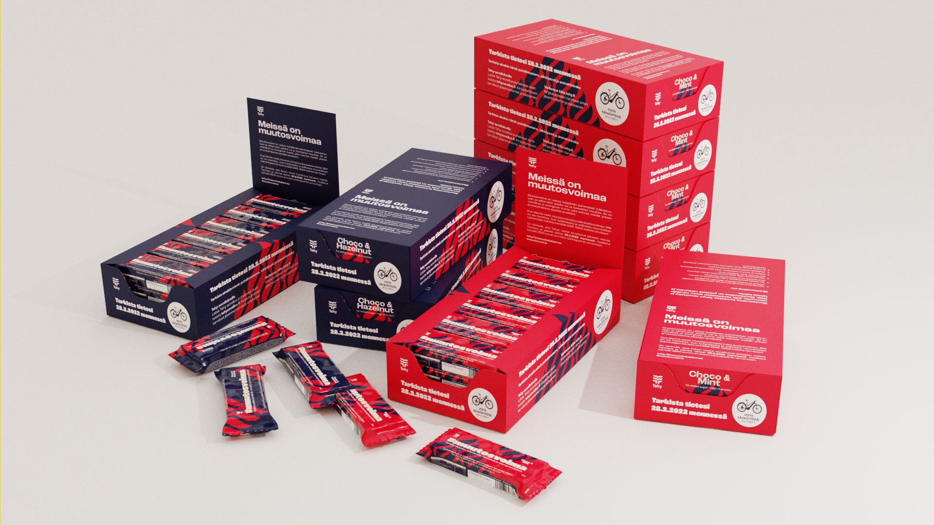
Tehy
Tehy’s brand was completely overhauled - the biggest update to their brand identity to date. The iconic logo was refreshed - one of the core decisions of the design process was when it was decided that it shall remain, but be updated - and everything else made anew from the ground up, stemming from a data-driven strategy and the needs and wants of the most important target group: its 160,000 members.
This project featured probably the longest period (about six months) of workshops and briefs before anything was actually done, and while there was some healthy to and fro on some matters, the brand visual core locked into place basically instantly, so the groundwork was definitely worth it.
I designed the graphic guidelines, a comprehensive illustration system and library (about 100 illustrations in 14 color combinations), graphic patterns, merchandise, exhibition layouts and everything else. The identity’s first outing was an ongoing, award-winning photography exhibition/campaign by Meeri Koutaniemi called Kasvokkain.
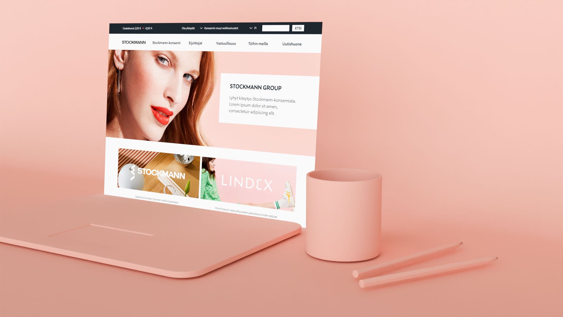
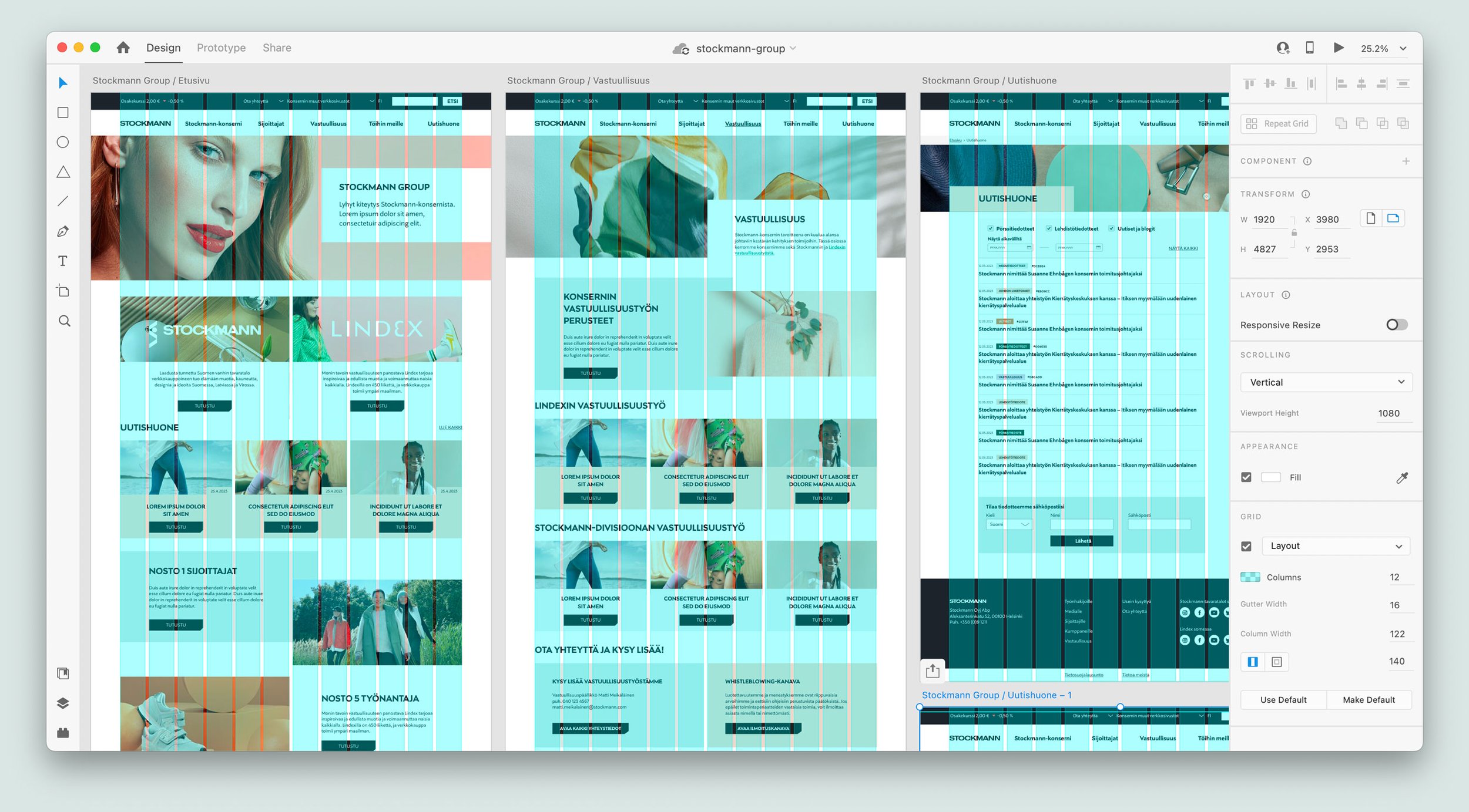
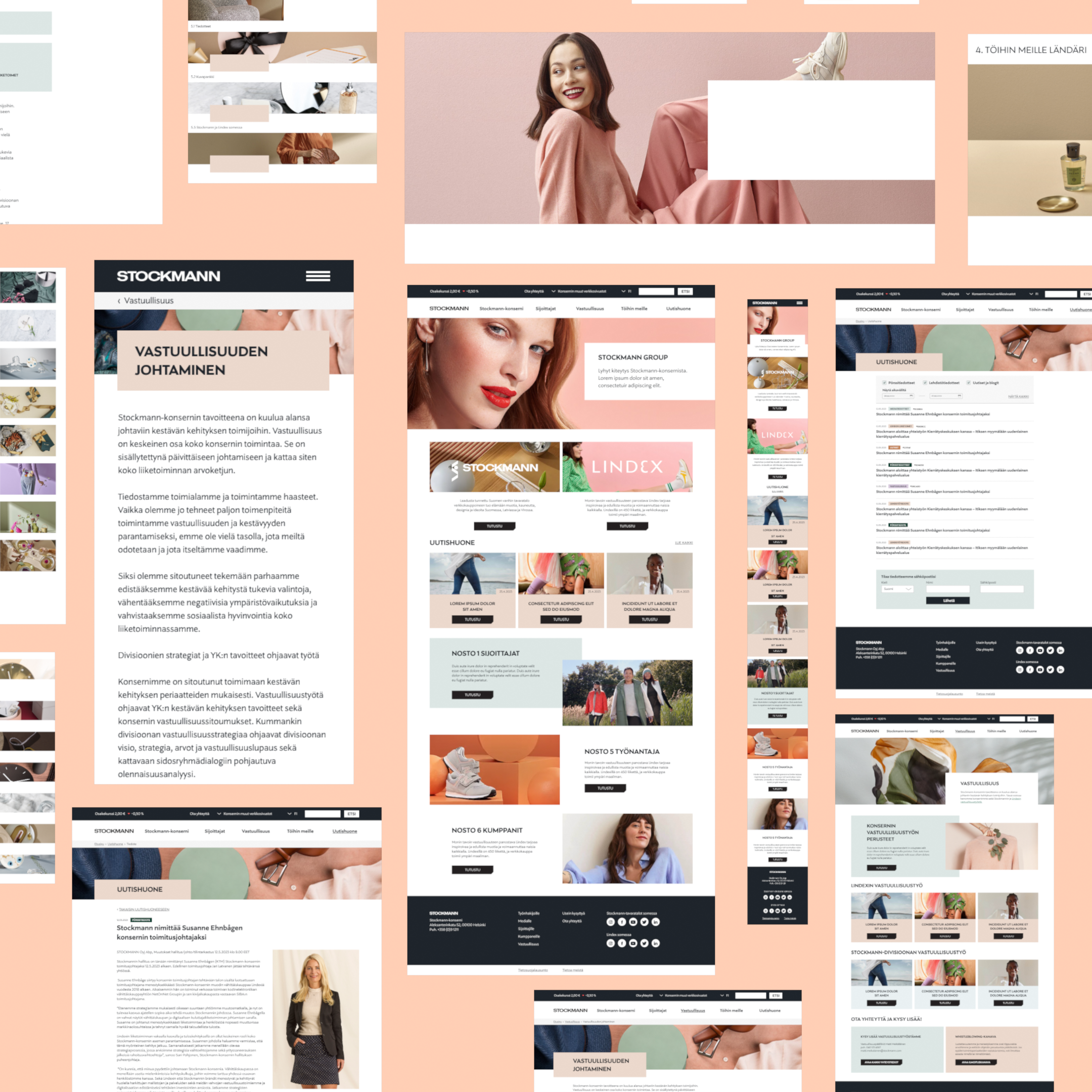
Stockmann Group
New website & identity work for Stockmann Group (shortly after renamed Lindex Group, but the design remains). Art direction, UX, website design.
This was mostly an exercise in restraint - the client wanted an identity that does not stray too far from the retail brand, but has its own subdued high-level feel. I chose a limited color palette and through some iteration we landed on what’s often the best idea: the simplest one. Removing the iconic escalator-esque icon from the logo was, in this case, enough. Designing the site was mostly a data reorganization logic workout and figuring out the simplest groupings for them. The layout basically dictates itself when the groundwork is done (but naturally made sure that no pixel is left behind).
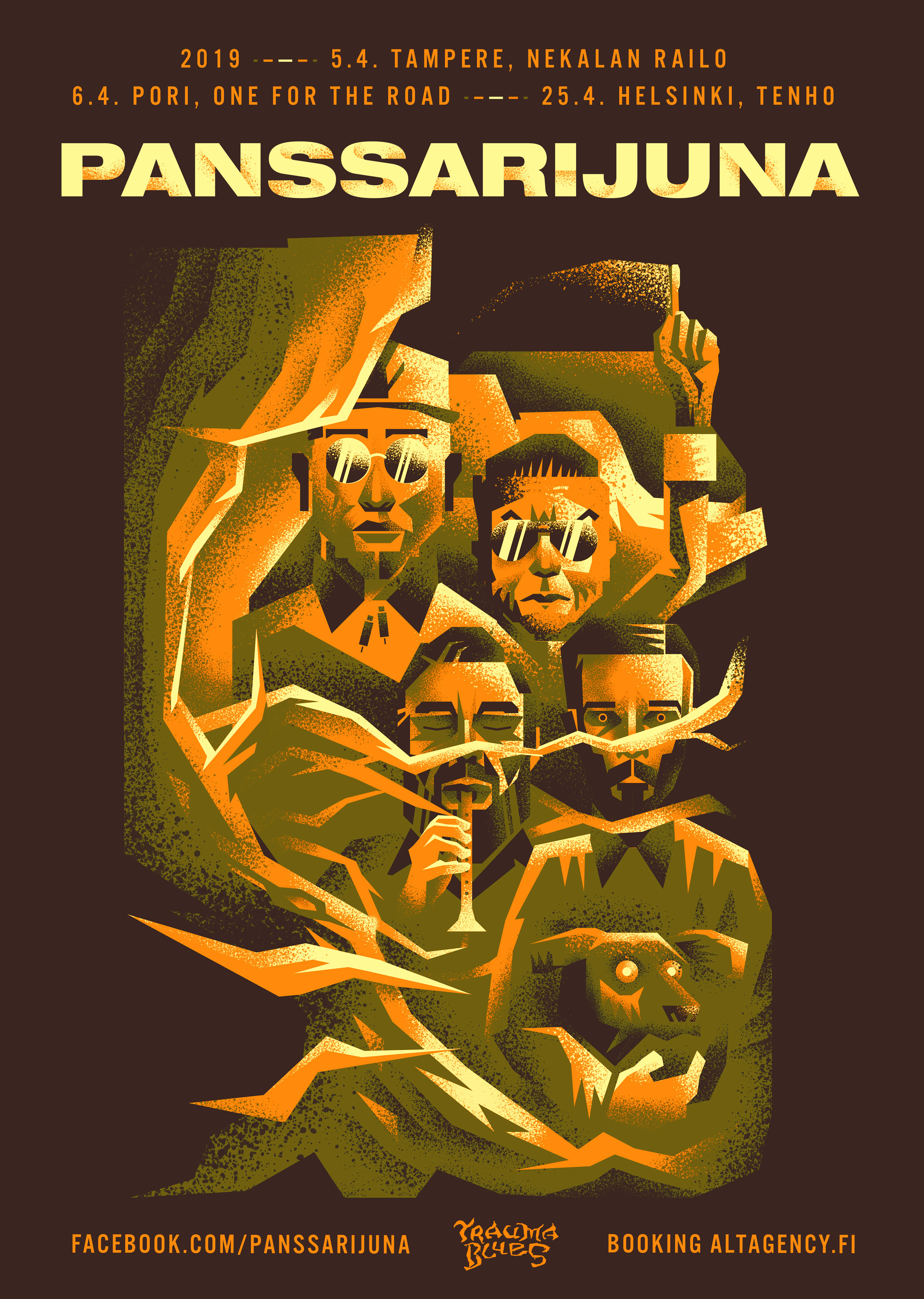
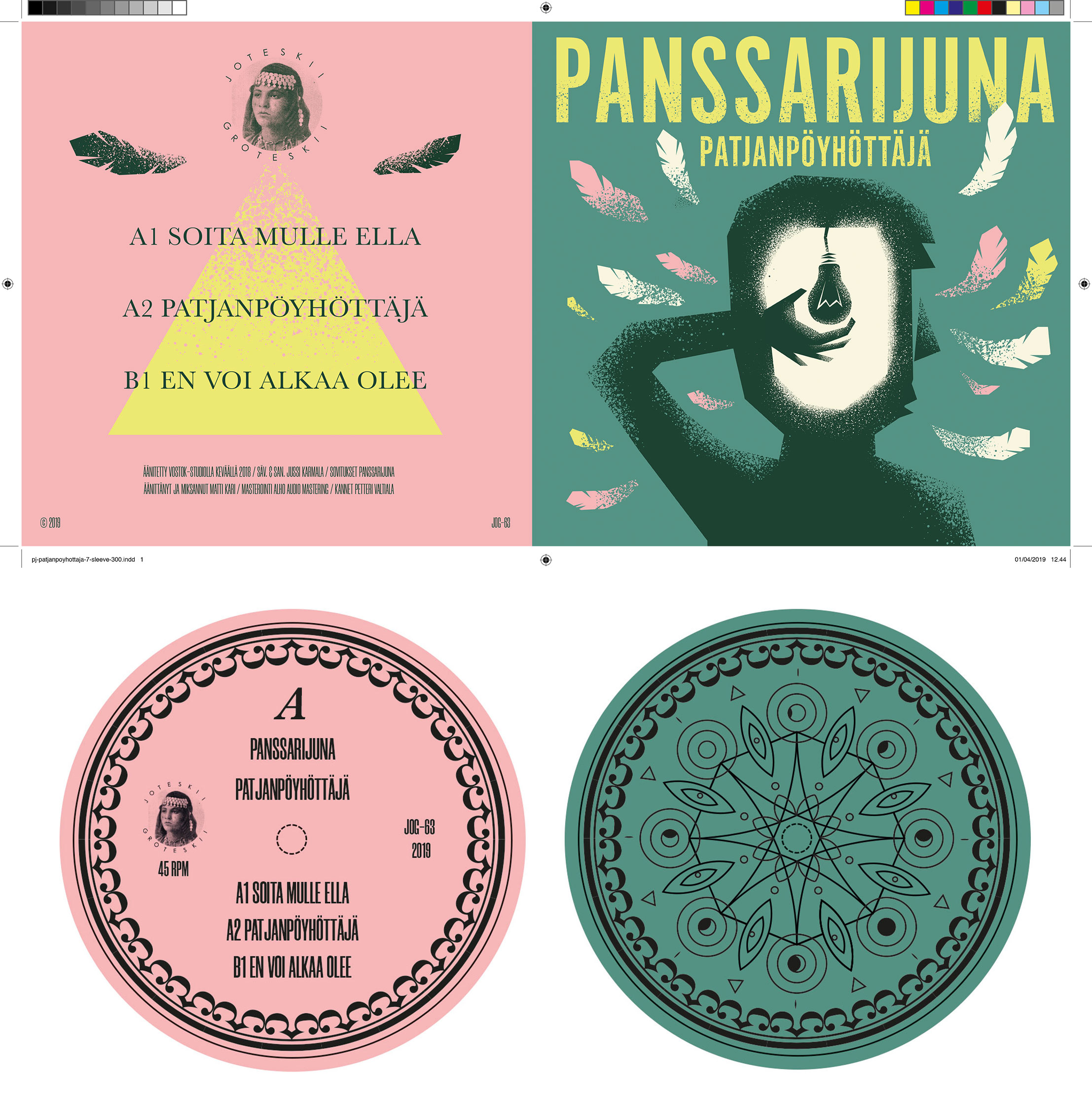
Porispere & Kirvatsin Jytä
A string of festival identities for this year’s trio of Pori-based festivals - Porispere (all-around popular music) Kirvatsin Jytä (nostalgia-tinged) & Minispere (sideshow/companion festival for young people/kids).
Porispere has a different look each year,, so more of a fresh coat of paint aligned to this year’s headliner the legendary Sex Pistols; Kirvatsin Jytä was built from the ground up as the old identity was deemed…old. Minispere is an offshoot off of the parent festival, but this time with a bit of minty character and even some characters. Fun stuff! Responsibilities: identities, marketing materials, motion design for social media/screens, website design (for Kirvatsin Jytä).


HelKama
A lightweight identity project for HelKama, aka Helsinginkadun Kamarimuusikot.


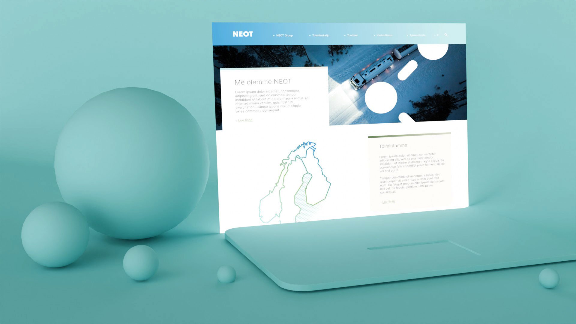
NEOT
Brand guidelines & visual identity for NEOT (chances are you’ve never heard of it, but a 10bn turnover puts them among the biggest companies in Finland). Their business is logistics and fuel supply, and that’s what the client wanted: a simple identity that somehow conveys their core strengths, but also sort of blends into the background.
Lots of workshop exploration on logistics-themed visuals and the logo, with the idea that NEOT is more or less the crucial link that keeps literally the engines running. In the end we distilled everything into a very simple logo and various connect-the-dots elements, and a subdued color palette.
Website originally designed by me, later augmented by client in-house.

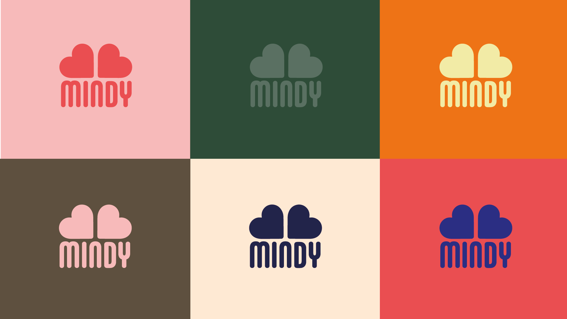
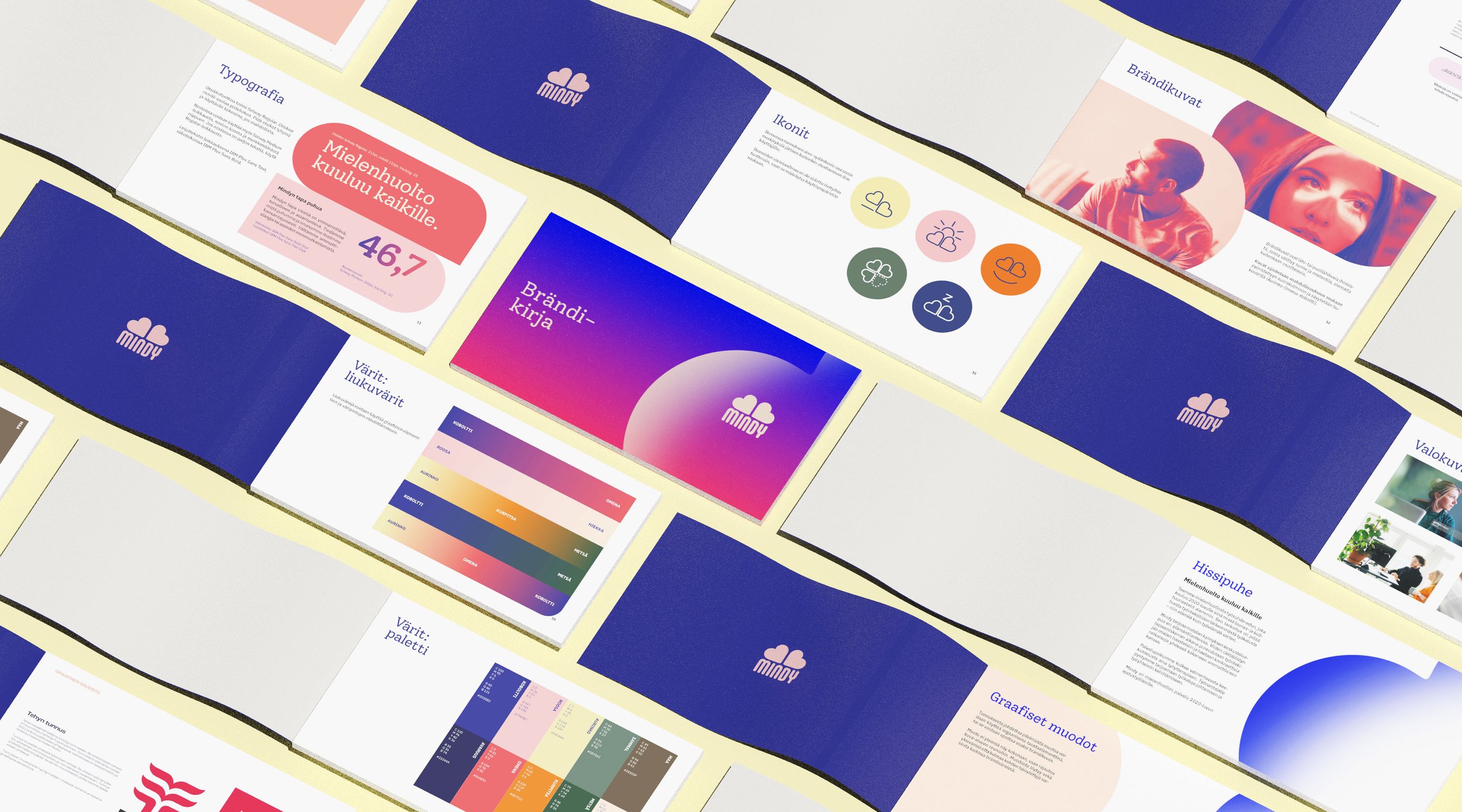
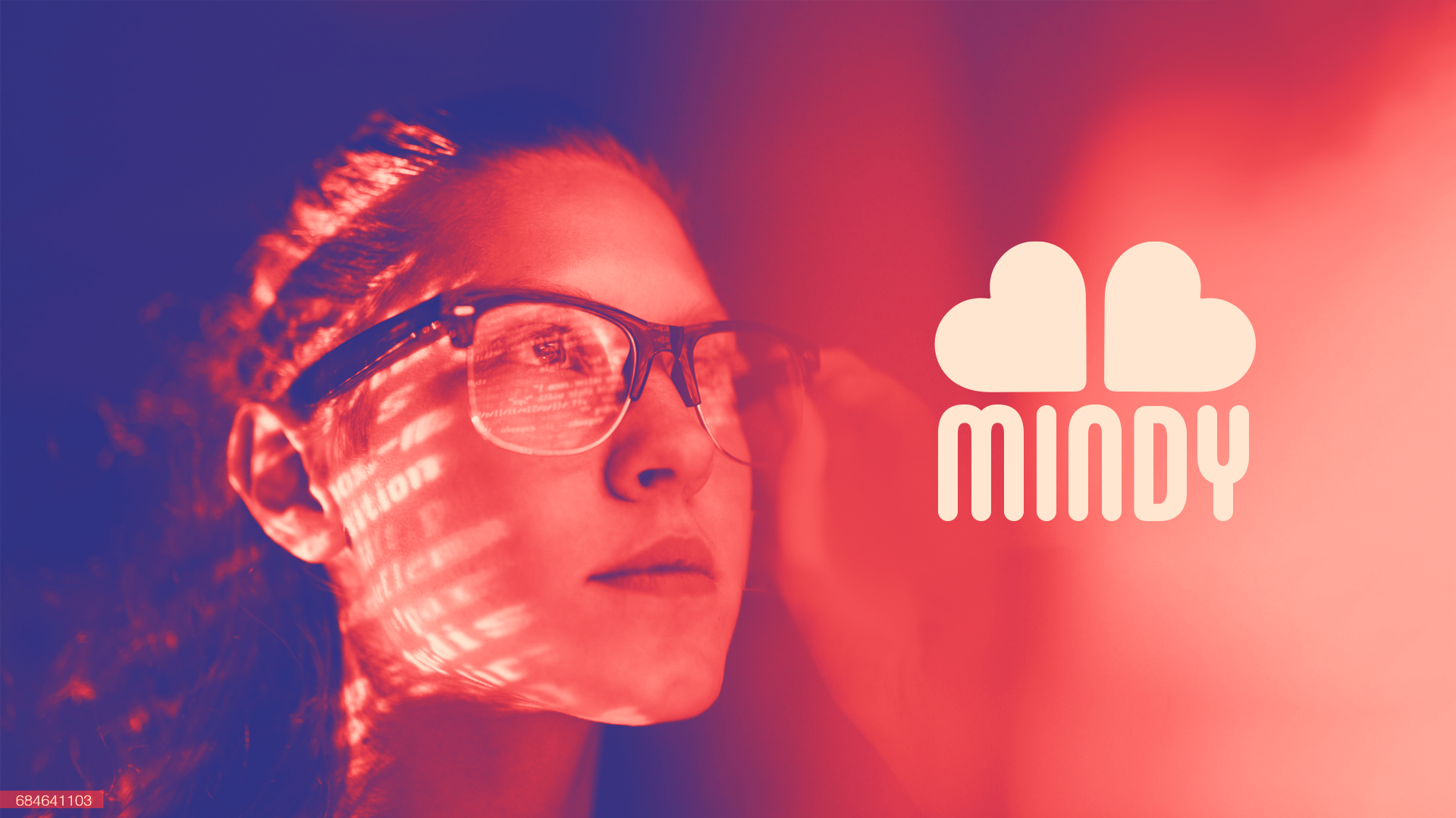
Mindy
Healthcare provider Heltti was launching a new low threshold mental health service, that needed to be both separate from the main brand but recognizably part of it - while having a voice of its own. I developed the logo & a simple visual language around it, along with a website design, icons et al. Role: brand visuals & manual from the ground up.


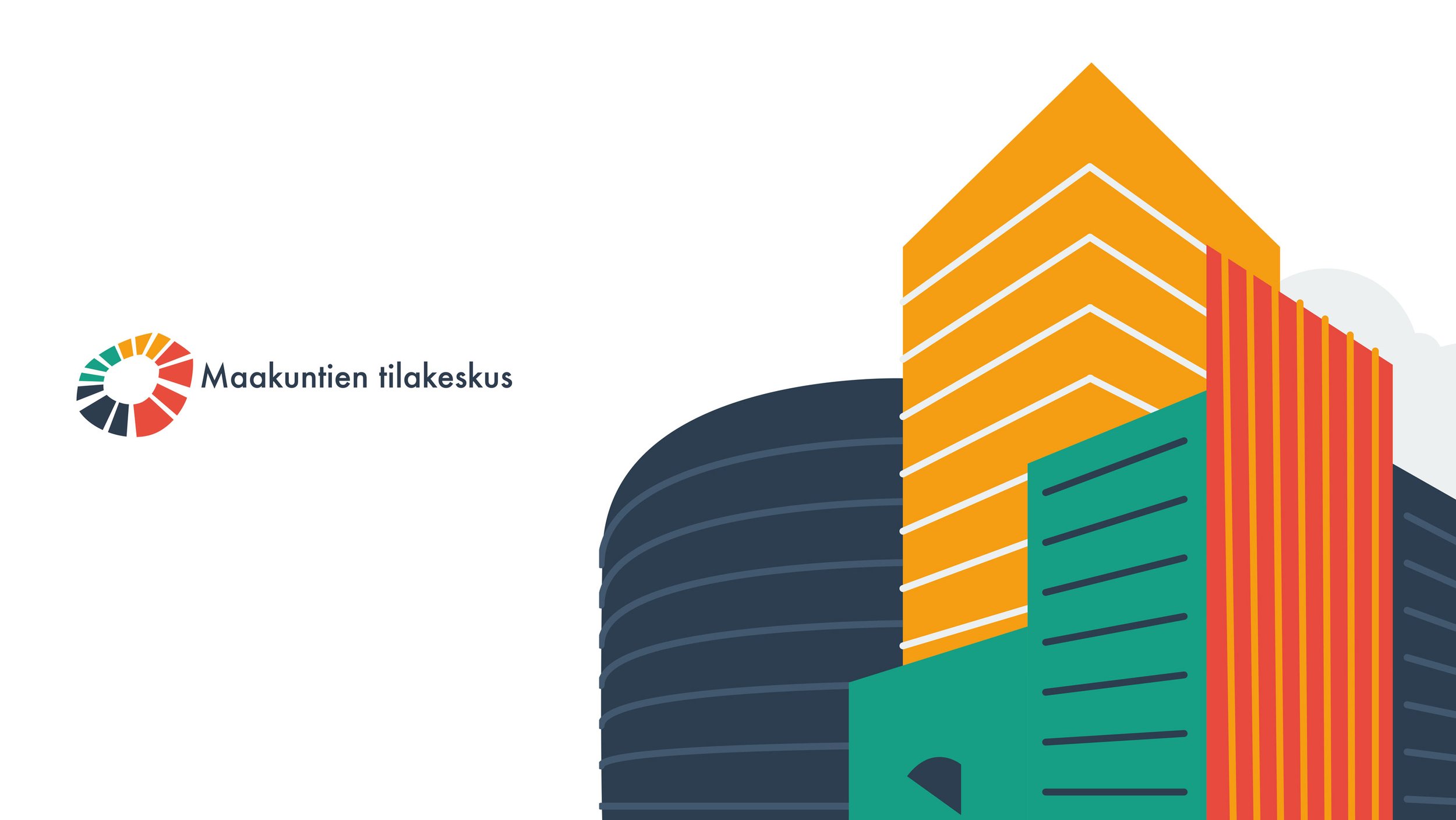
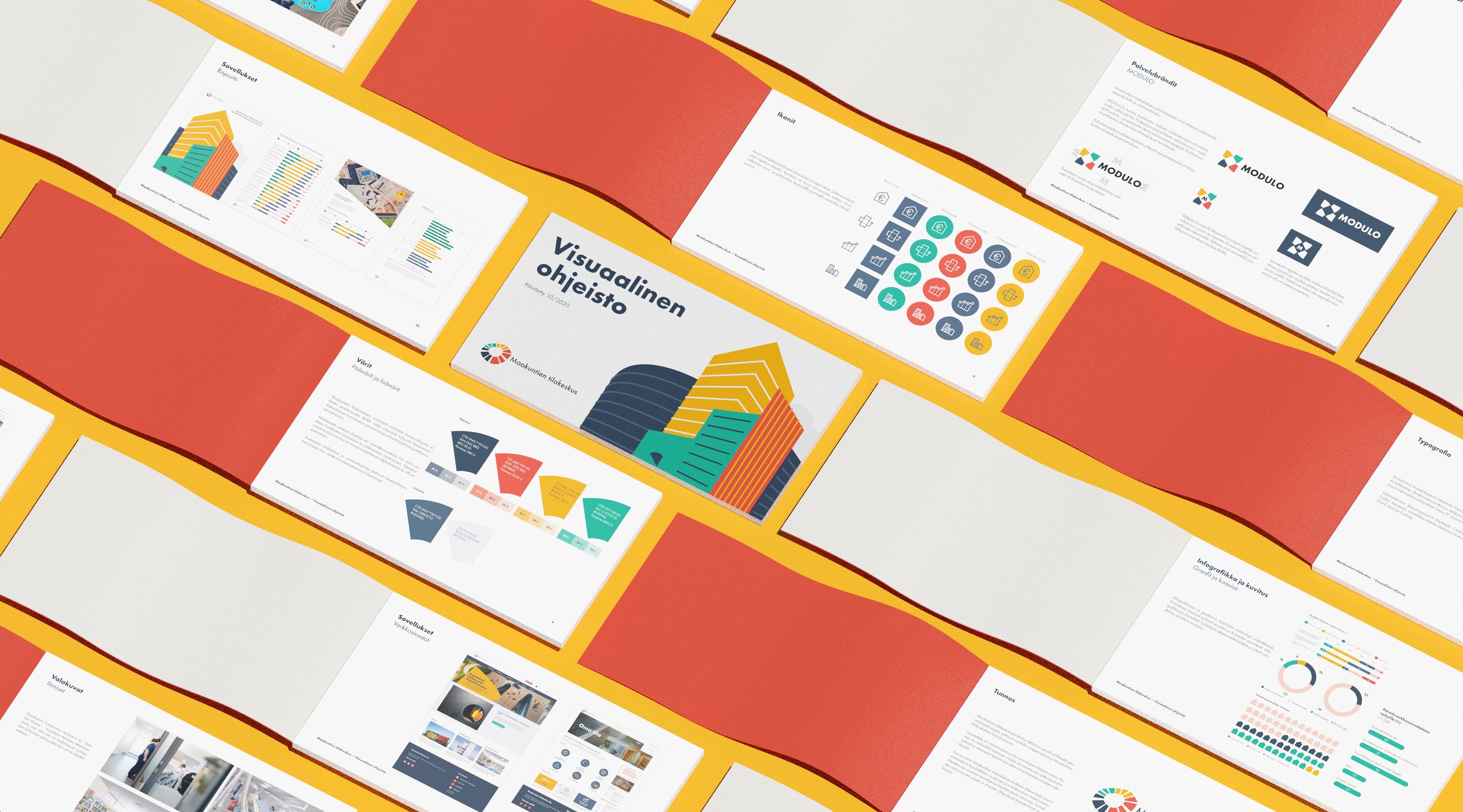
Maakuntien tilakeskus
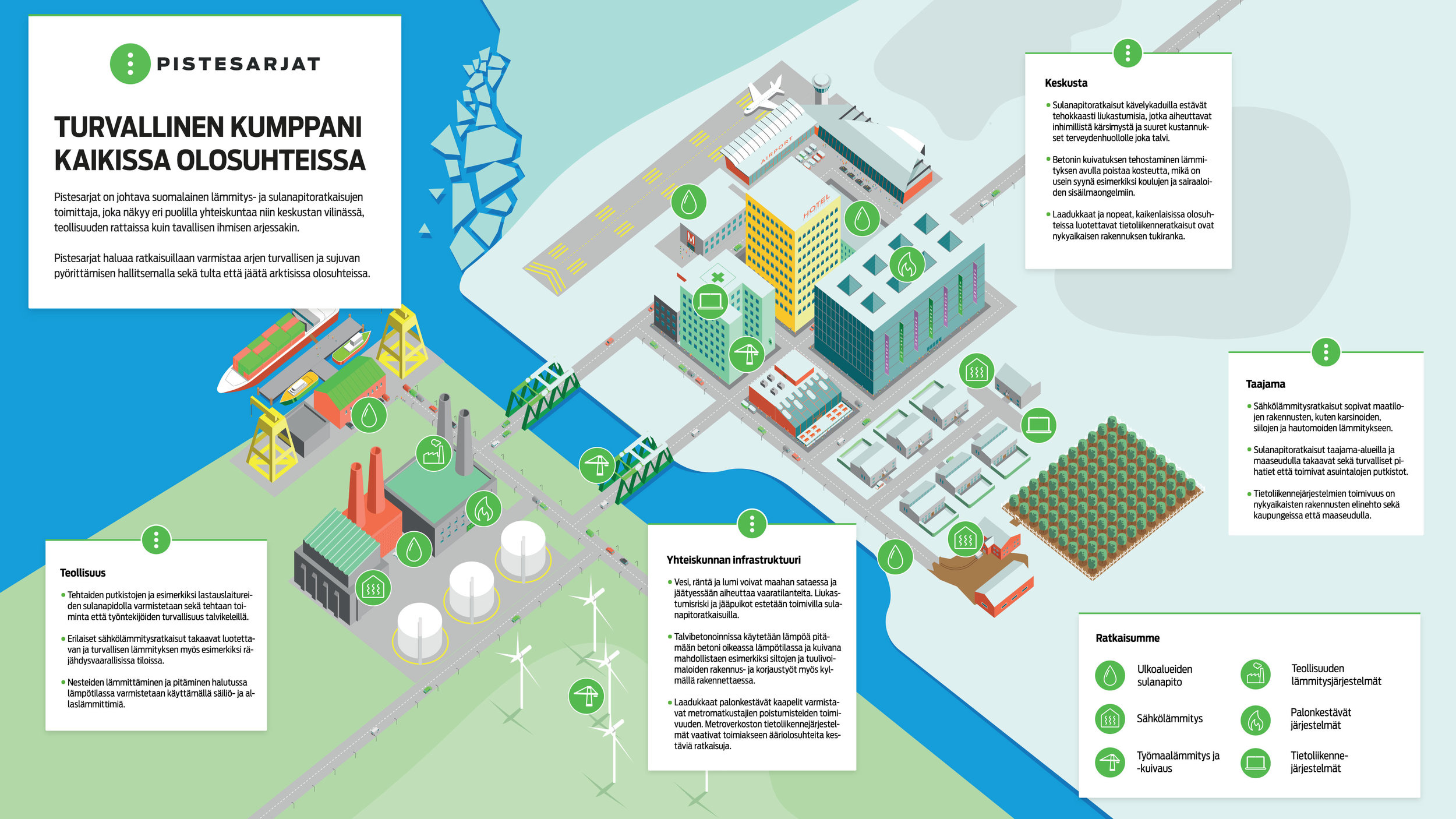
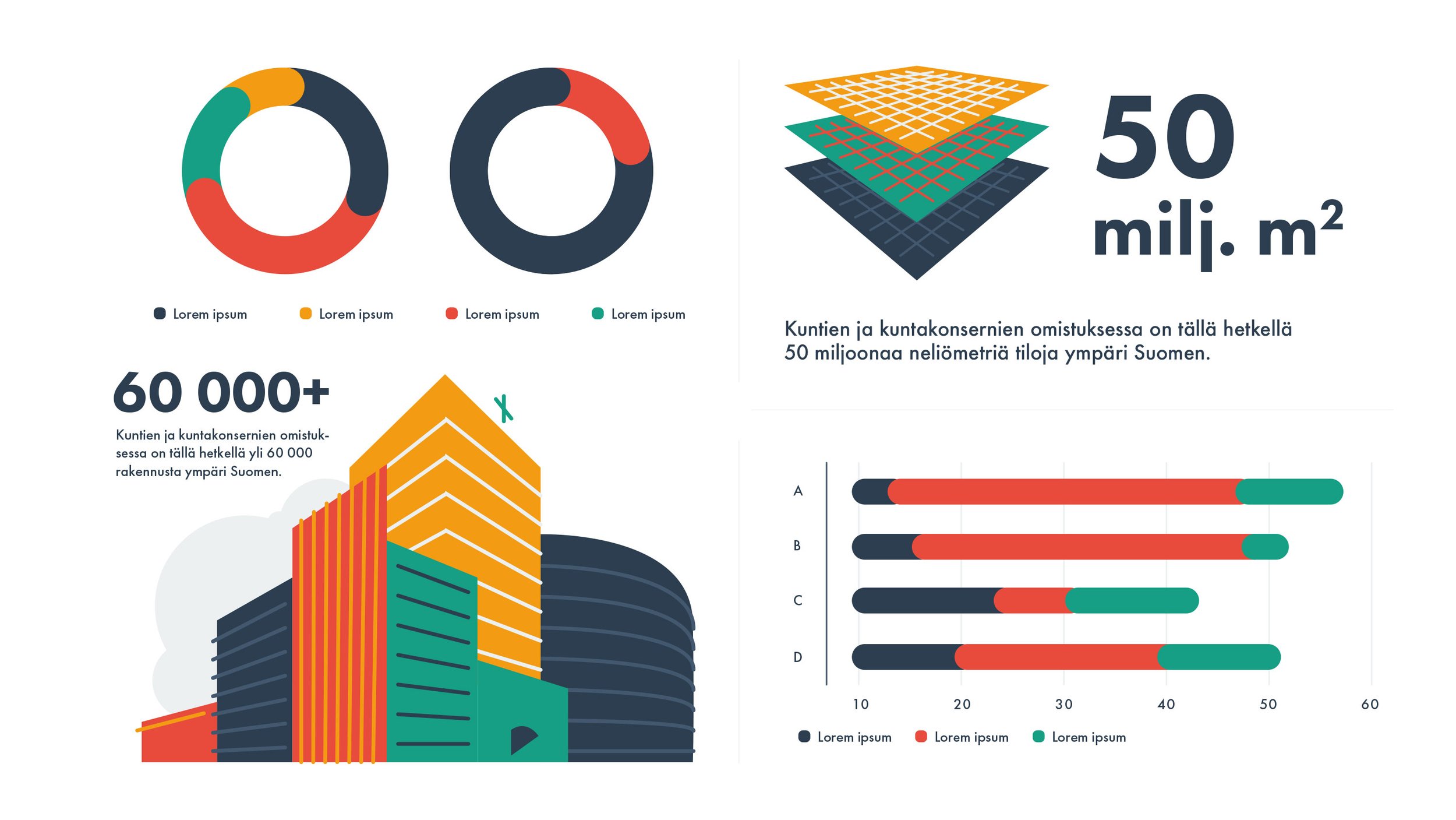
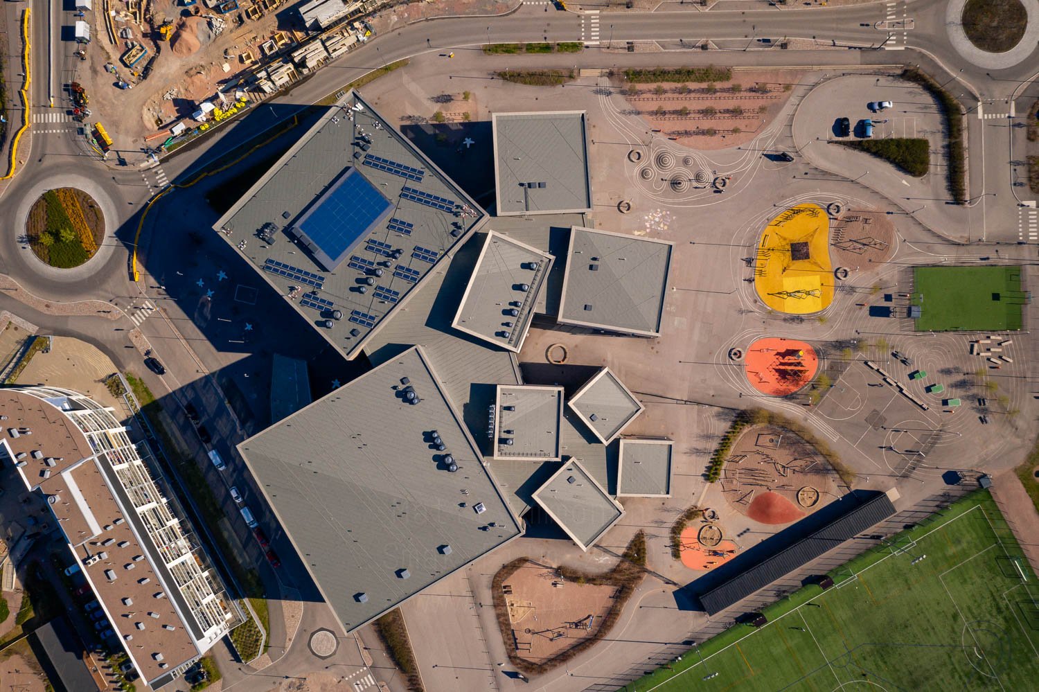
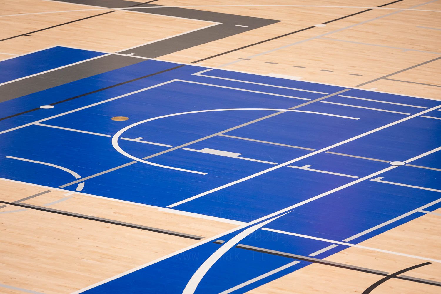
Maakuntien tilakeskus is an information service that takes care of databasing and providing data for most or all of government-owned real estate, such as hospitals and schools. They had a barebones brand (and the logo, that remained untouched) established, that needed both fleshing it out and refreshing. I took the existing brand elements a bit further, developed both a language of graphic shaeps and a modular illustration system, a website, redid the brand manual, developed templates for publications & a pandemic-friendly photography style (shot by Matti Immonen) and designed a sub brand for a service called Modulo.
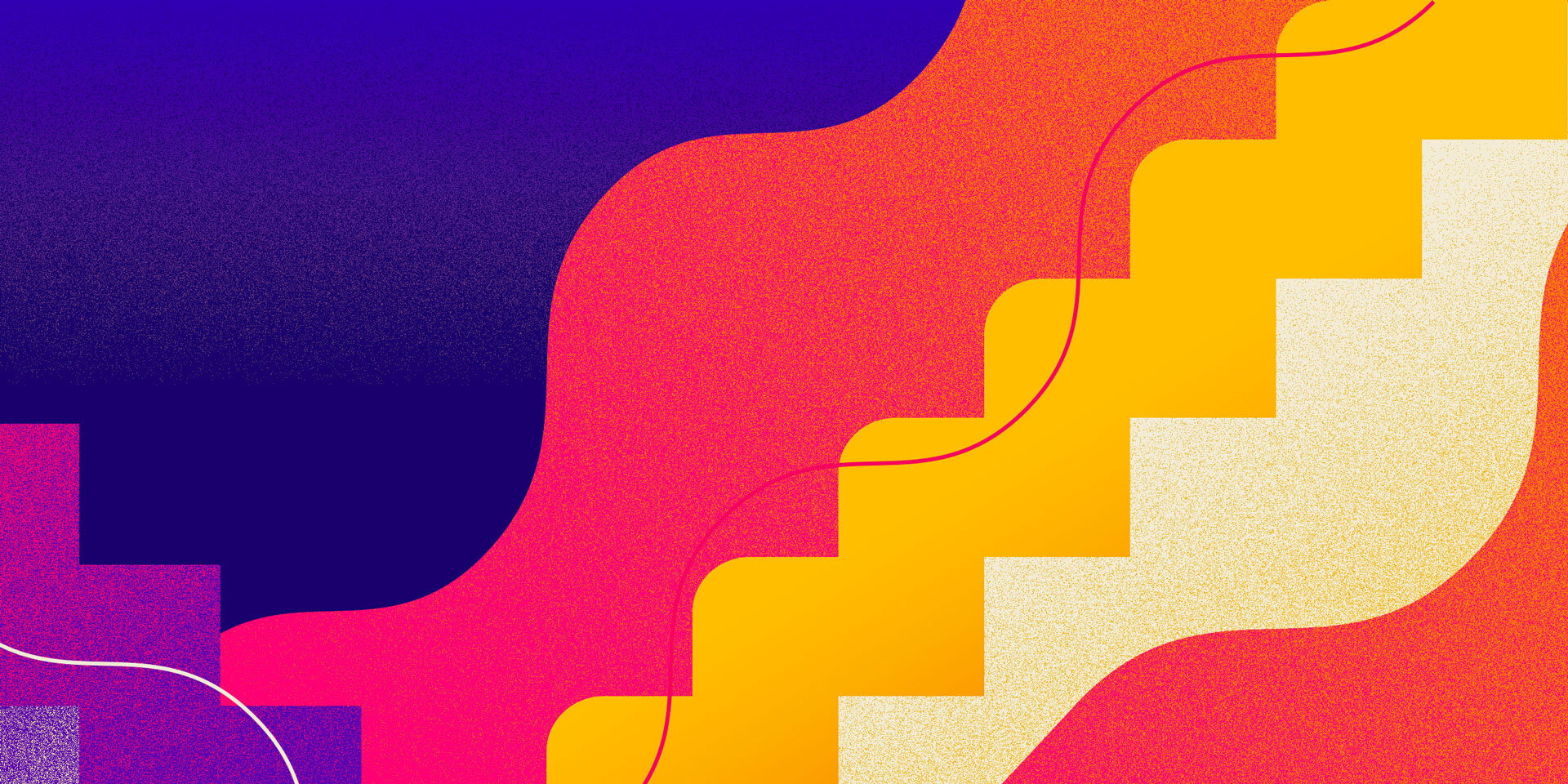
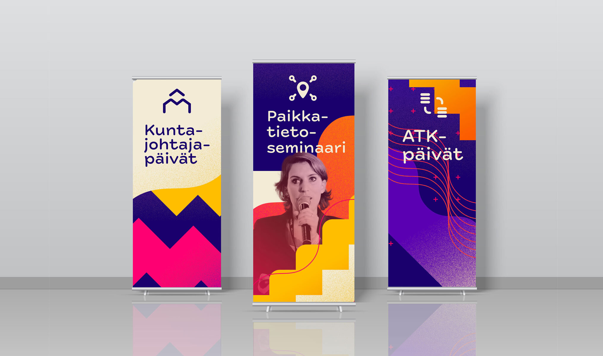
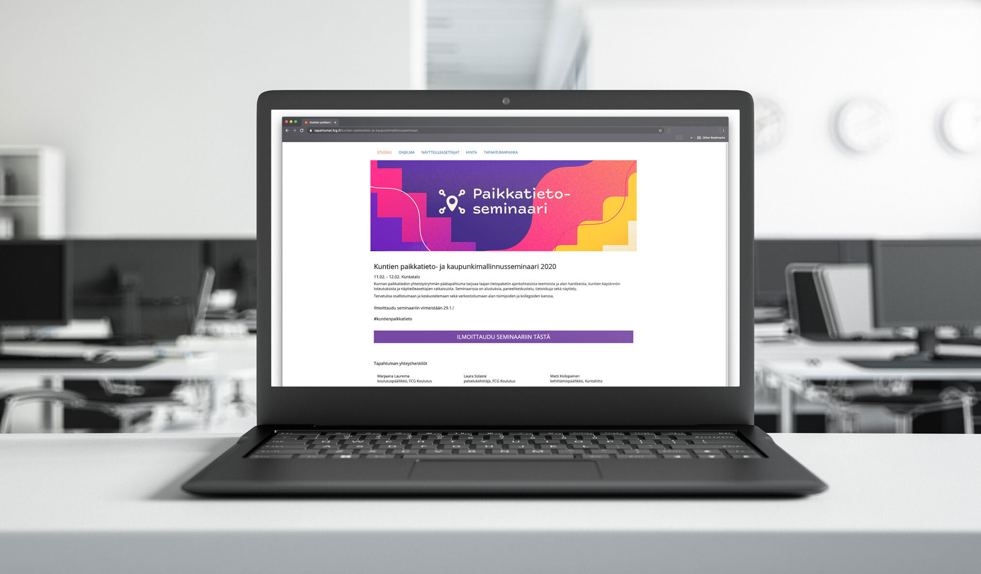
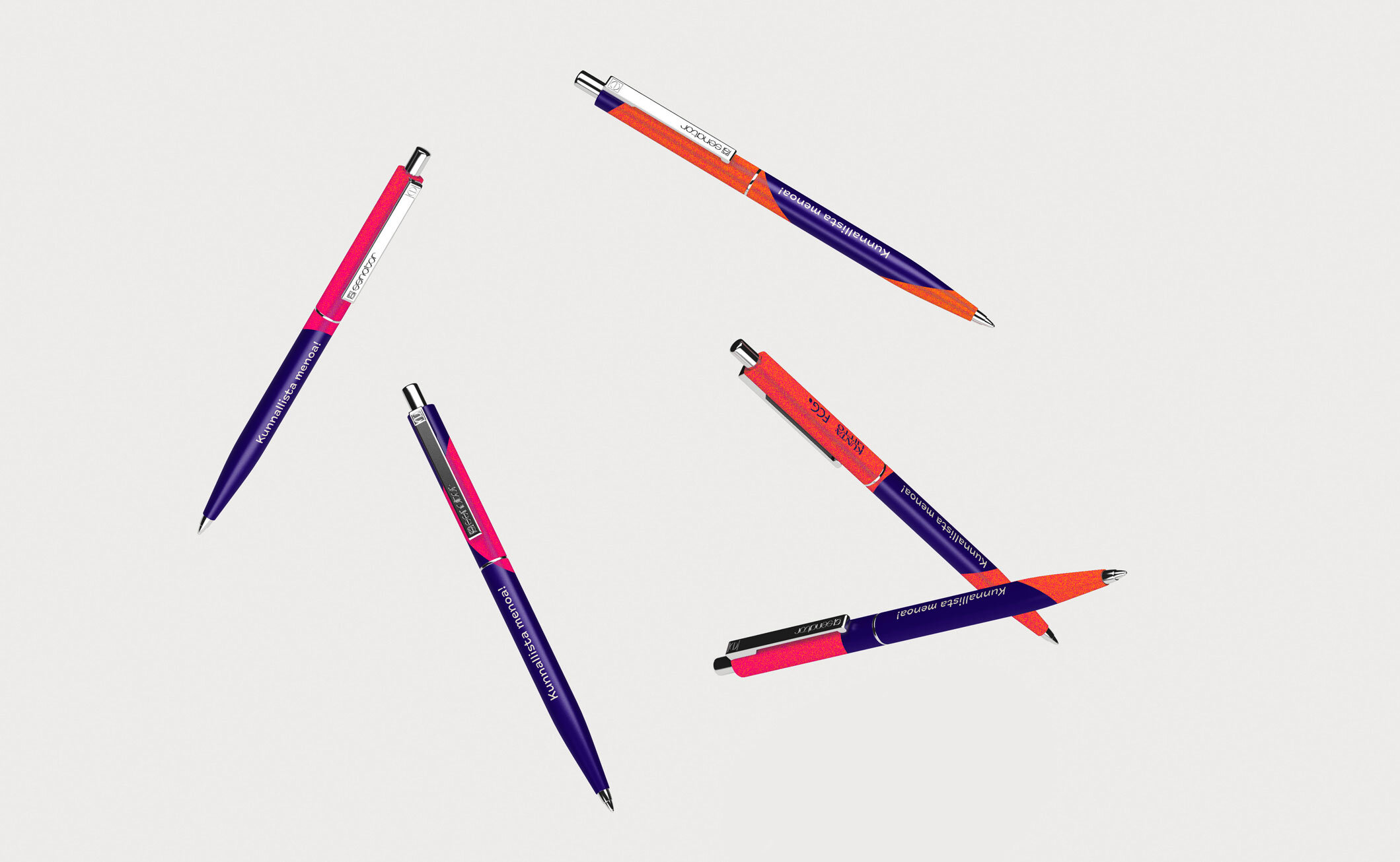
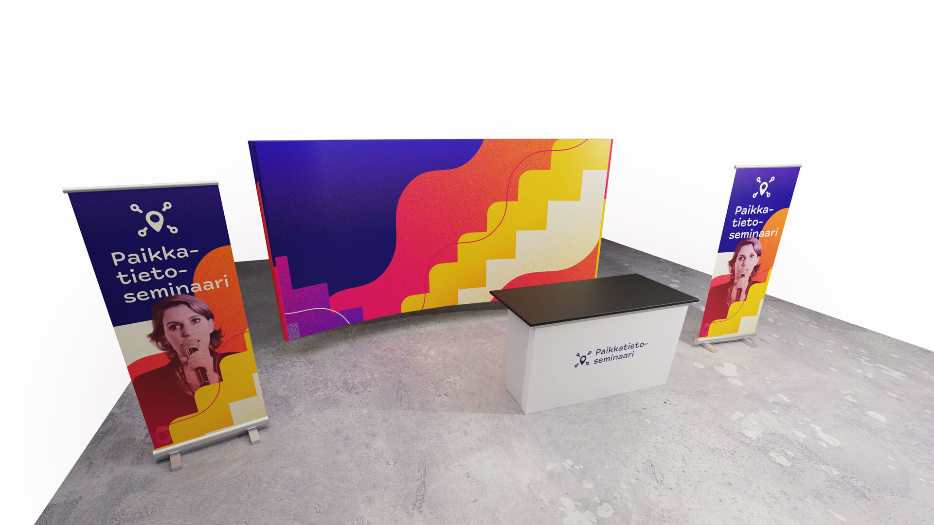
FCG
The Finnish Consulting Group needed an identity for their series of seminars and exhibitions, so I designed a modular system of graphic elements, icons & image styles to assemble from.
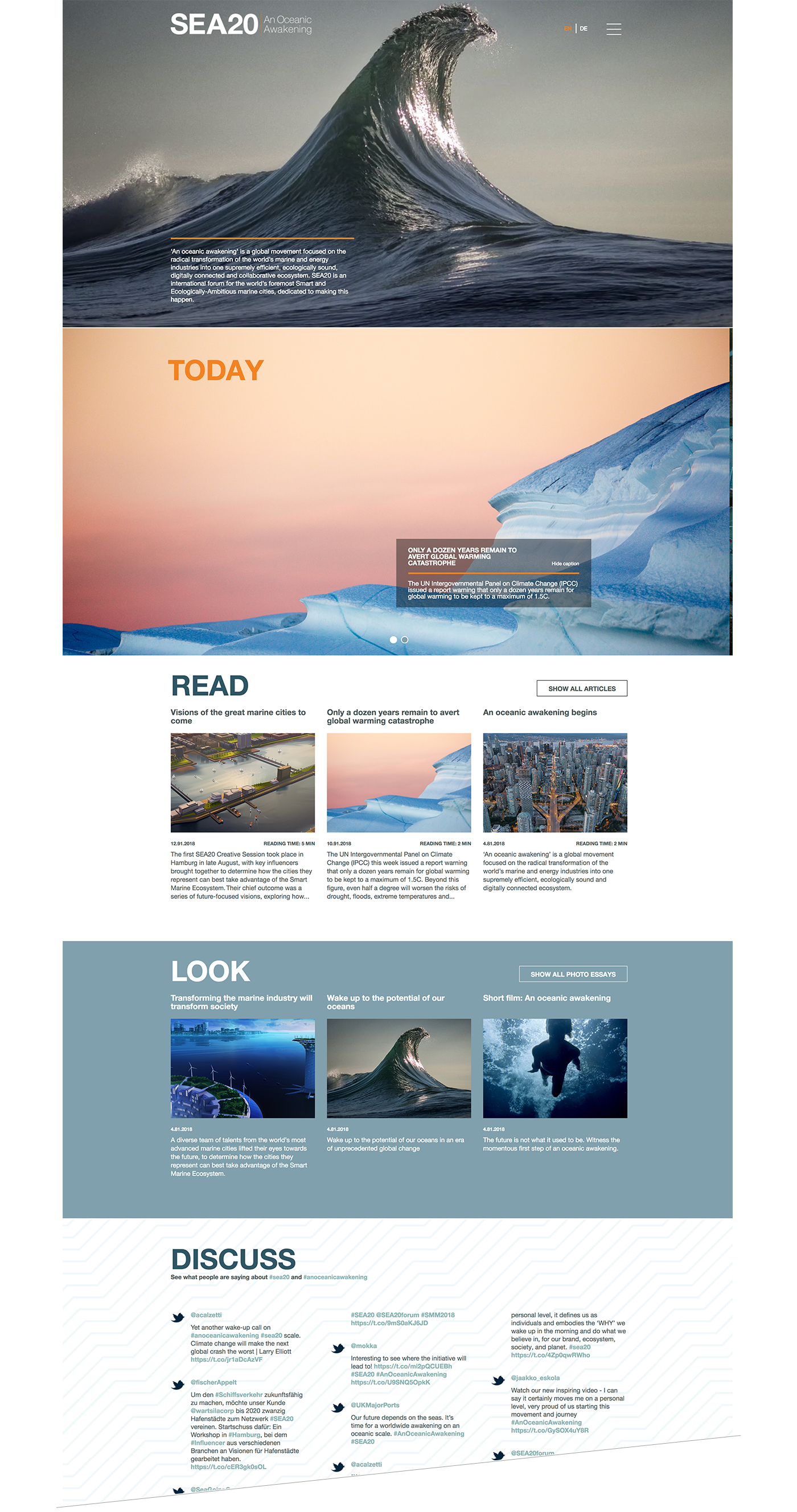
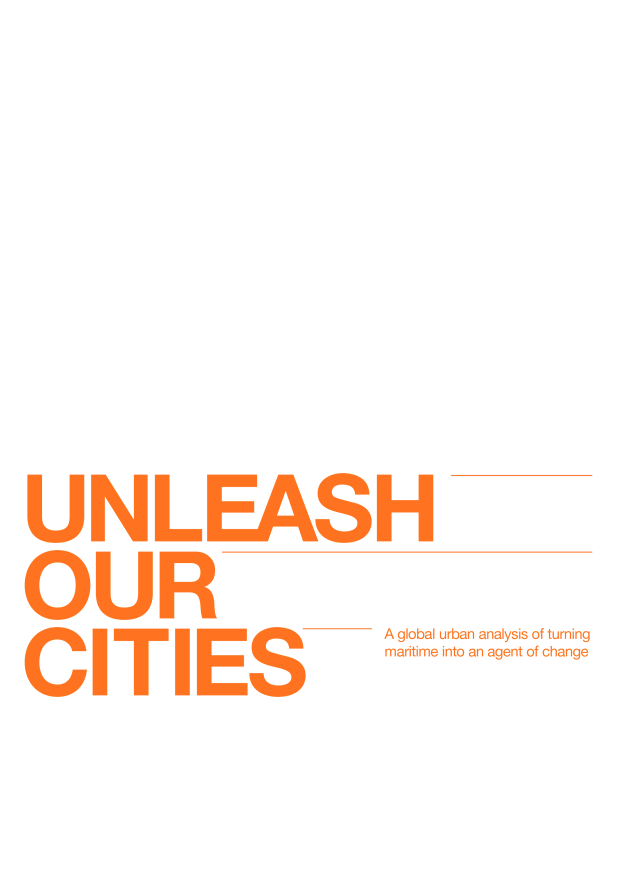
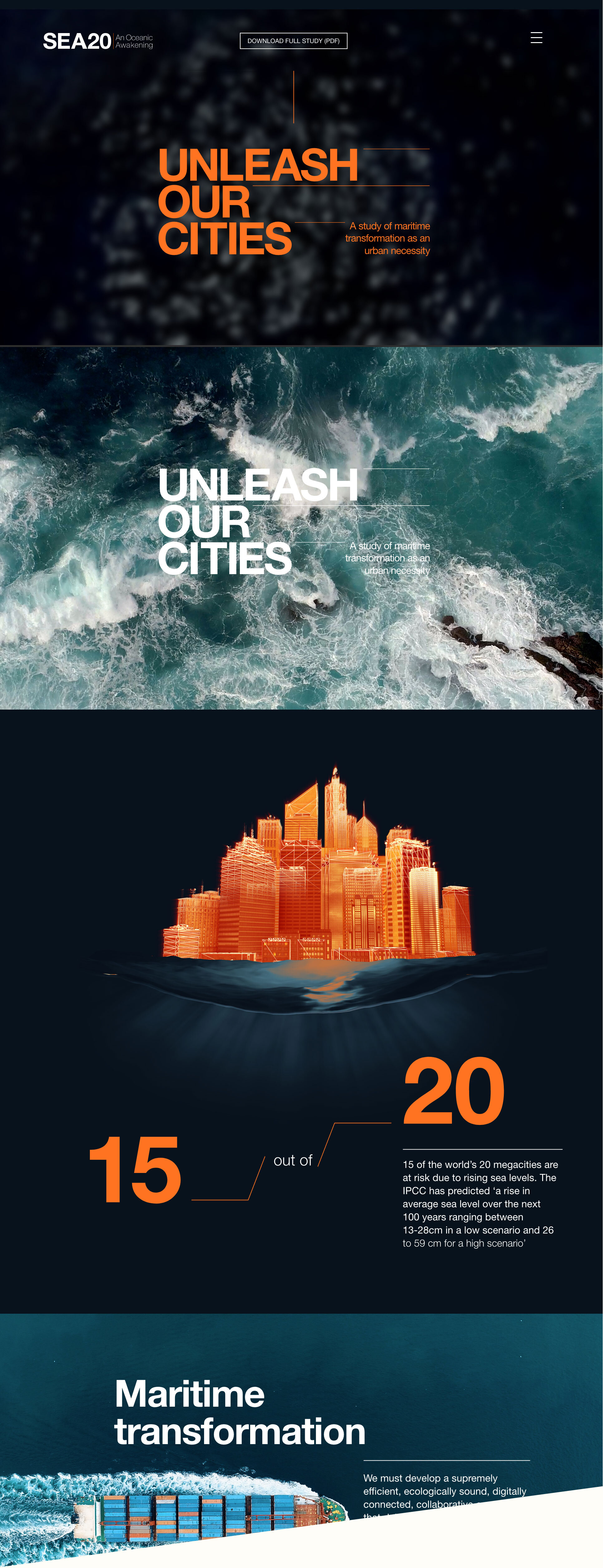
SEA20
SEA20 is a worldwide not-for-profit initiative by Wärtsilä that aims to connect smart and ecologically ambitious maritime cities to facilitate the transition to a smarter and more sustainable global maritime ecosystem. I did the visual design for the website, sound design & art direction for videos and general look & feel for publications and studies for the project. The visual design of this project & the annual report (also designed by me at the time) ended up pushing a whole new image concept for the Wärtsilä brand.
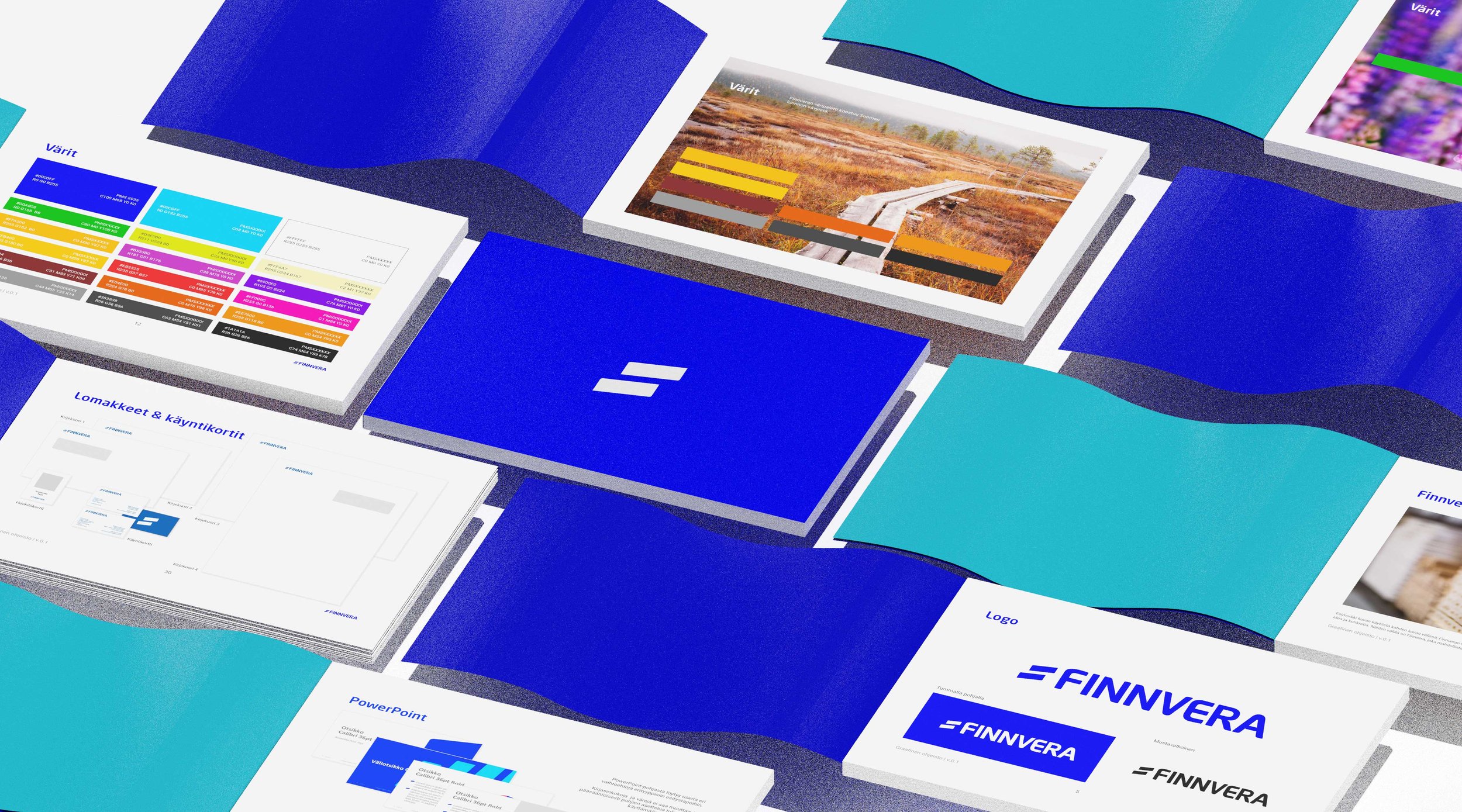
Finnvera
Finnvera’s comprehensive brand renewal. Logo, brand manual, brand photos, digital, lots of templates and publications. Still in good use.
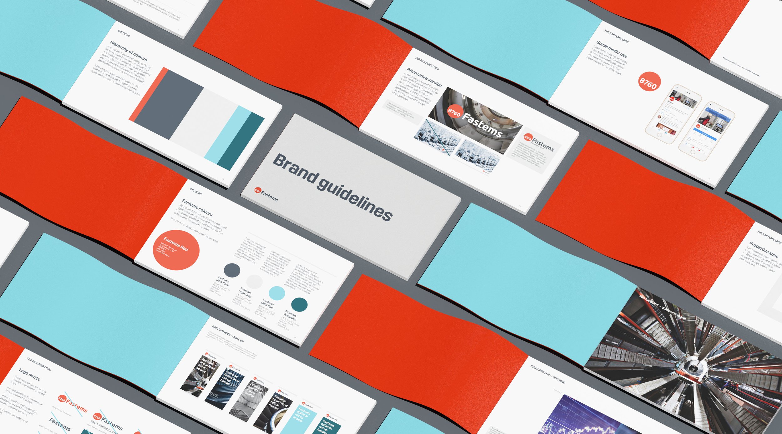
Fastems
Brand refresh for robotic automation developer Fastems. Manual, a photography system to accommodate for multiple levels of brand aspirations & all the usual shenanigans.
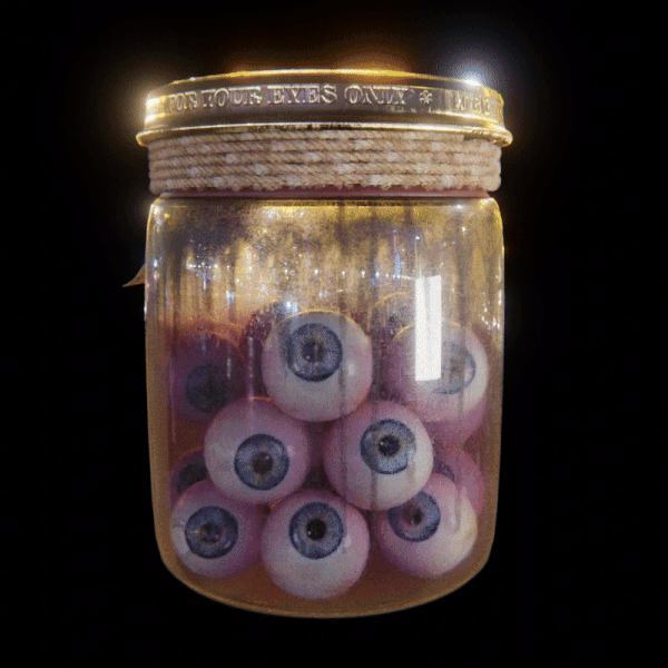
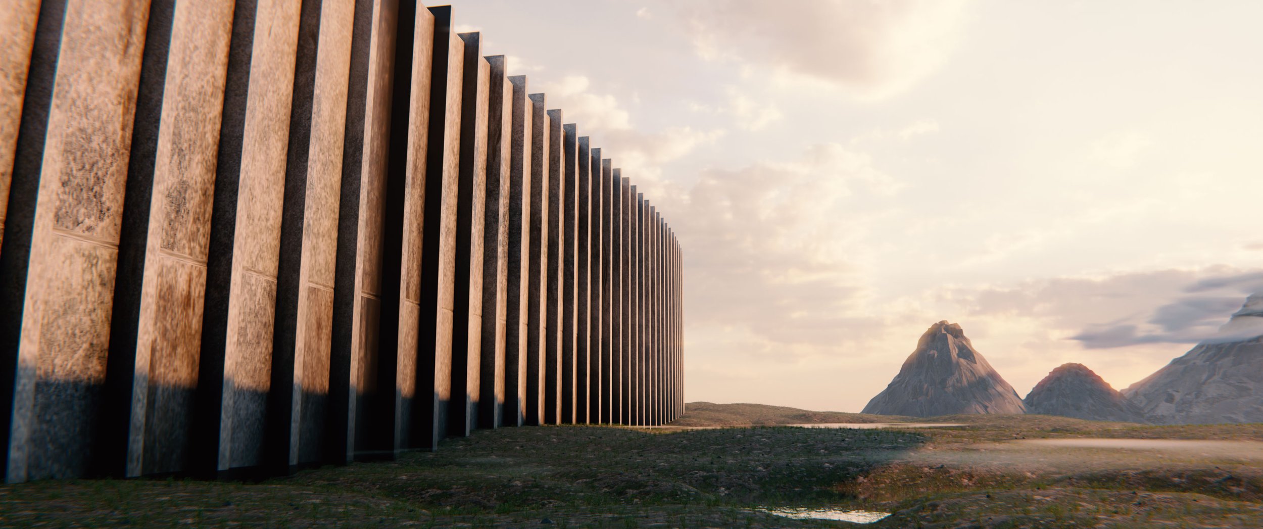
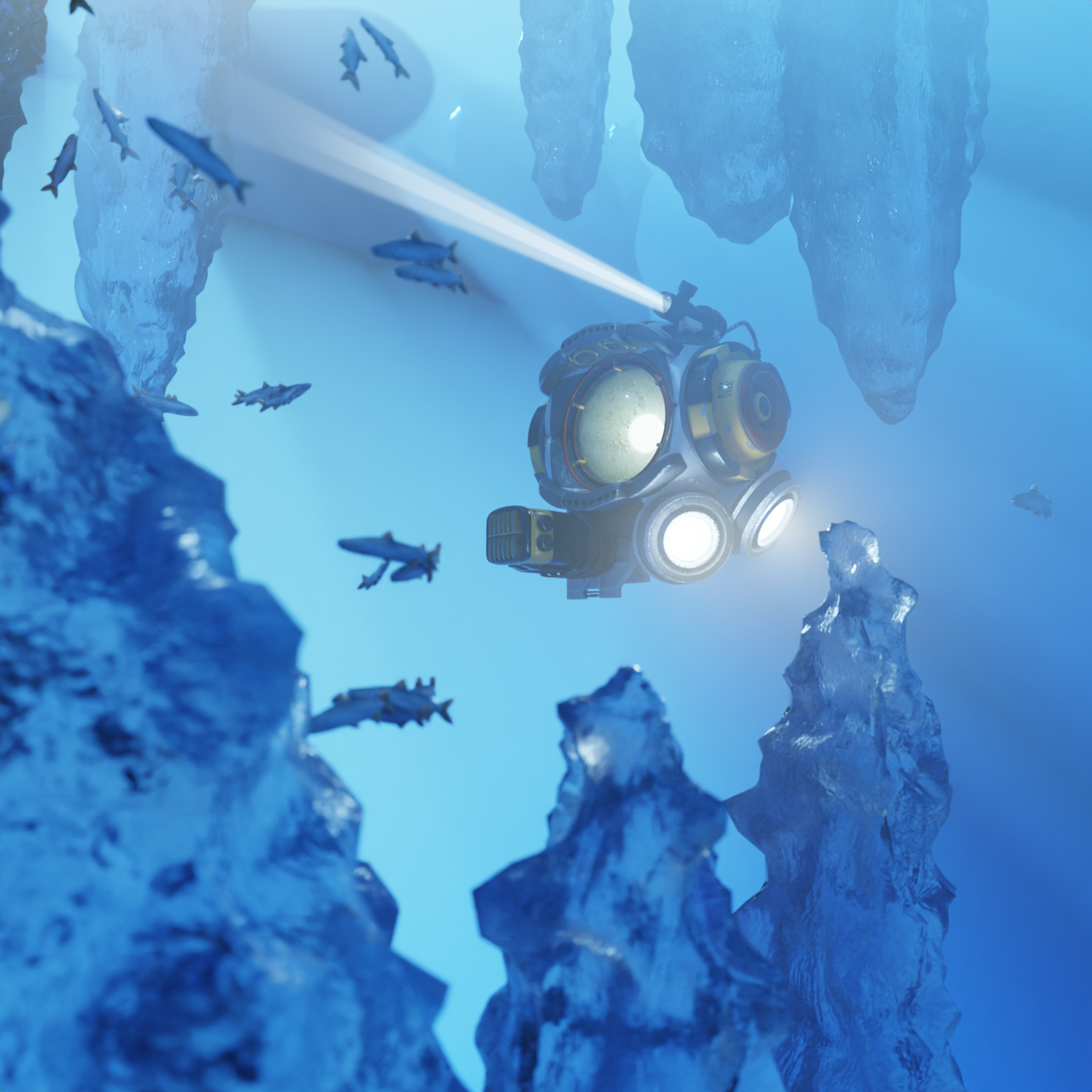
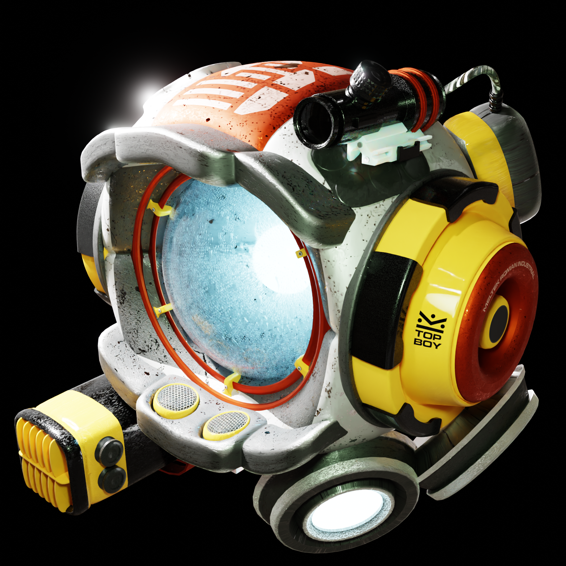
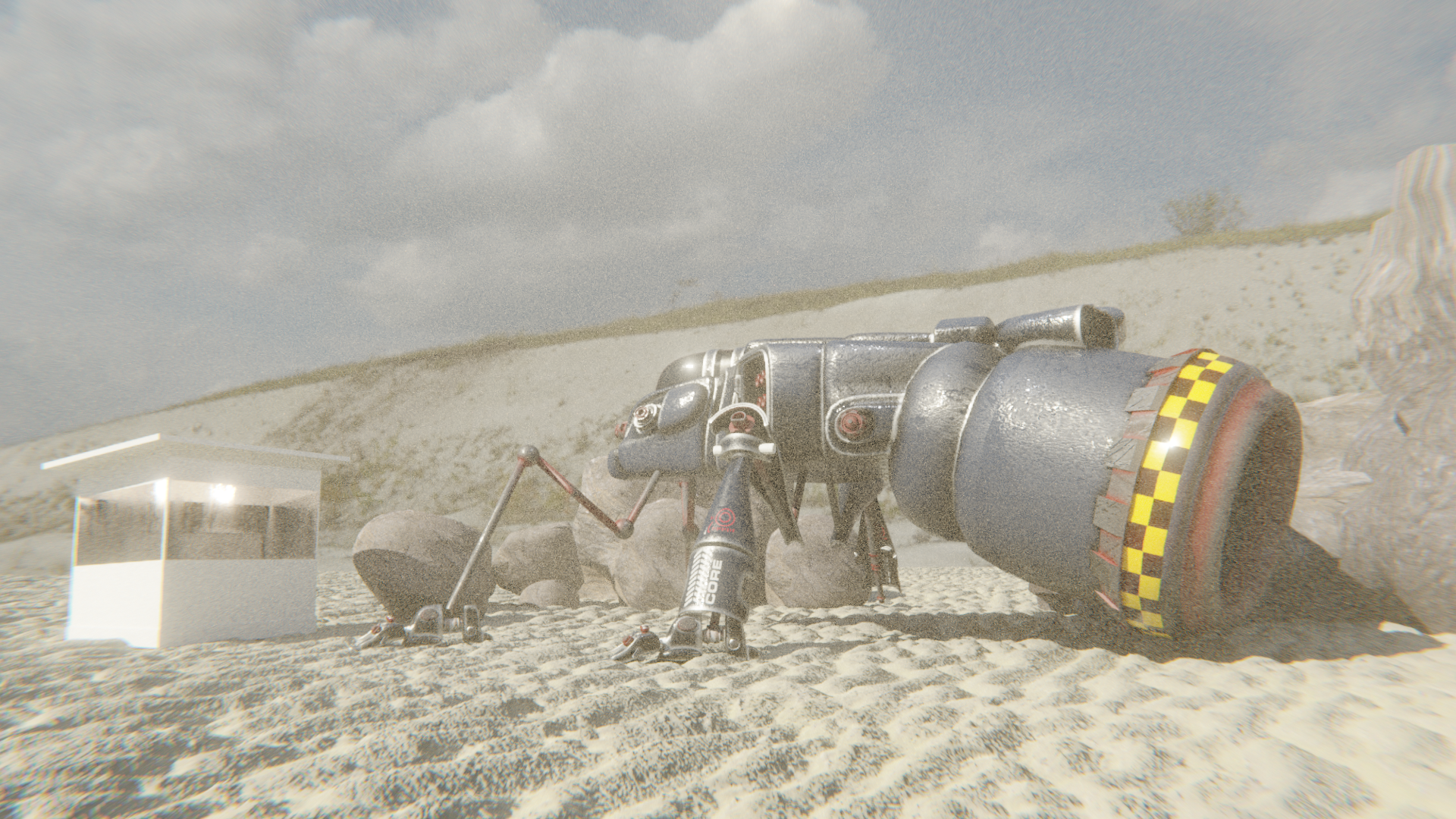
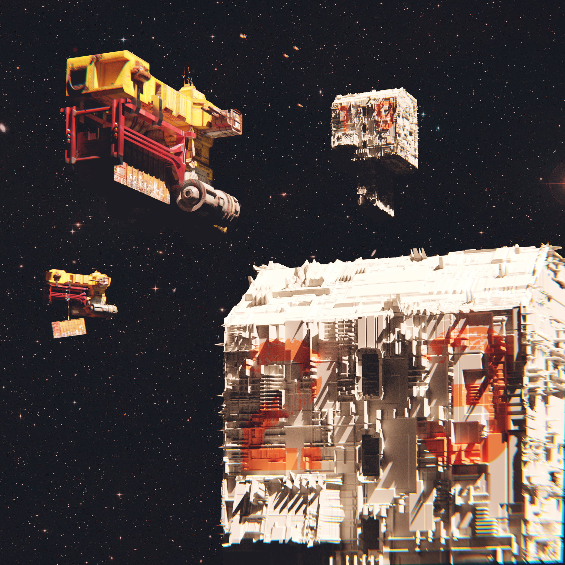
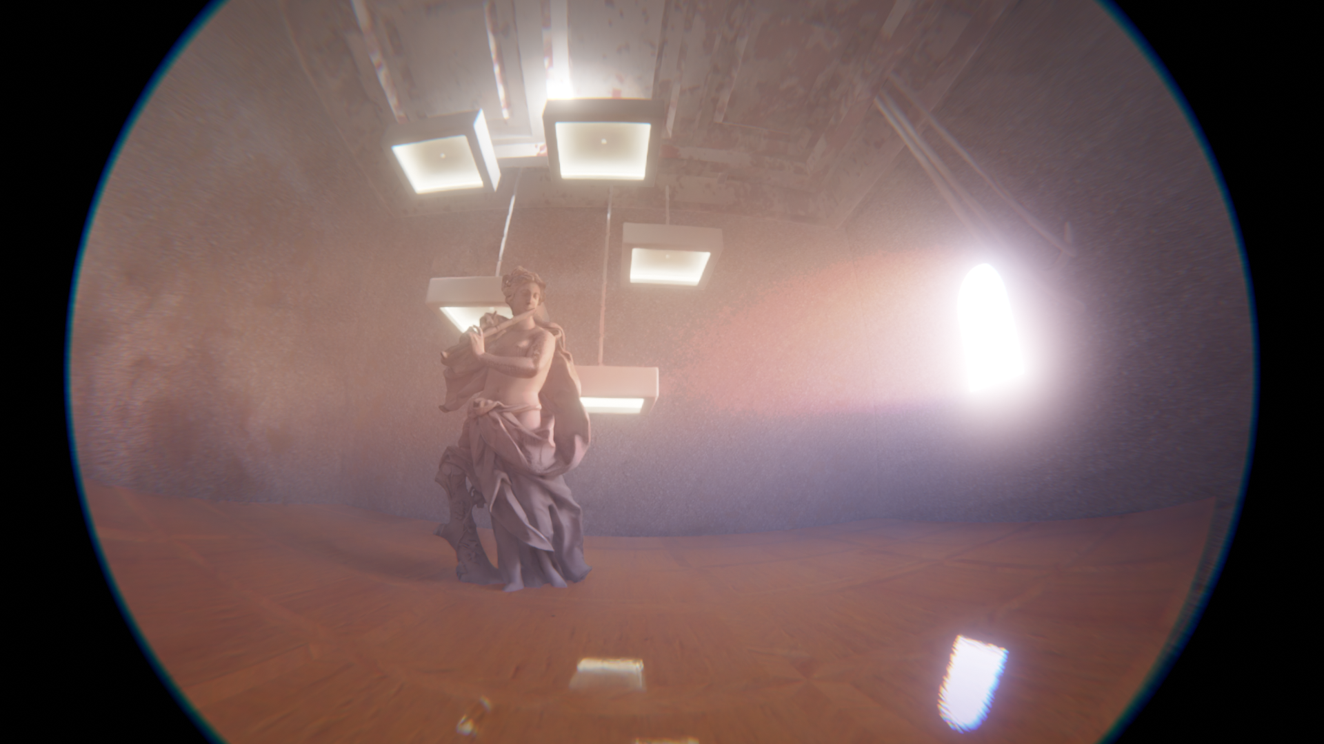
3D
3D modeling, texturing & animation. Commercial & personal.
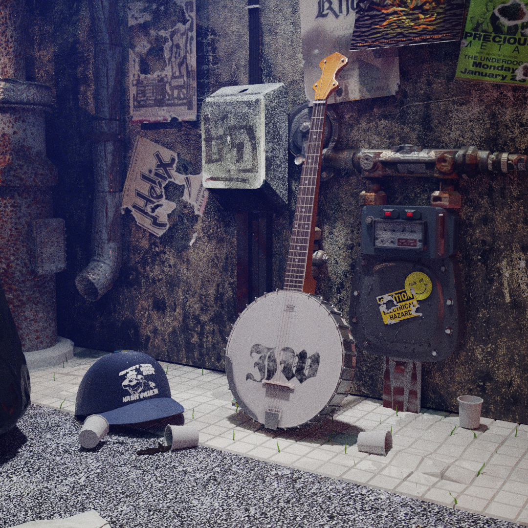
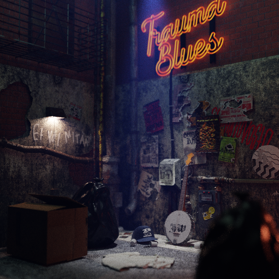
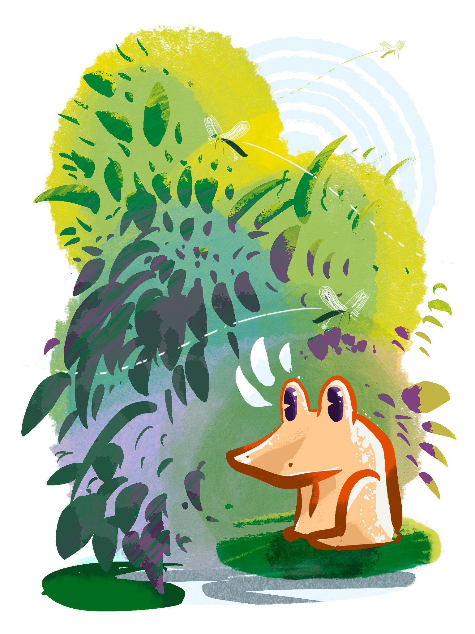
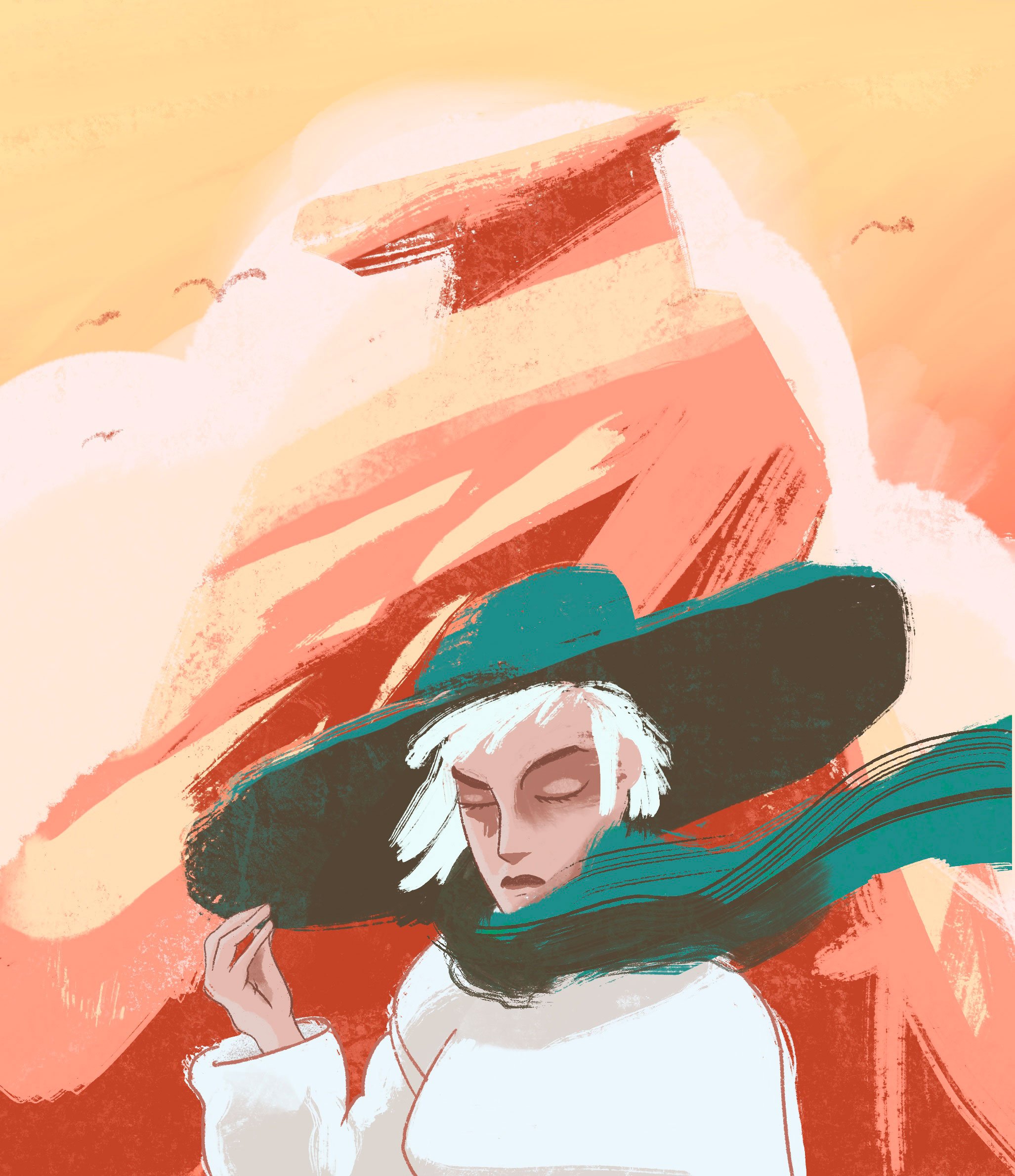
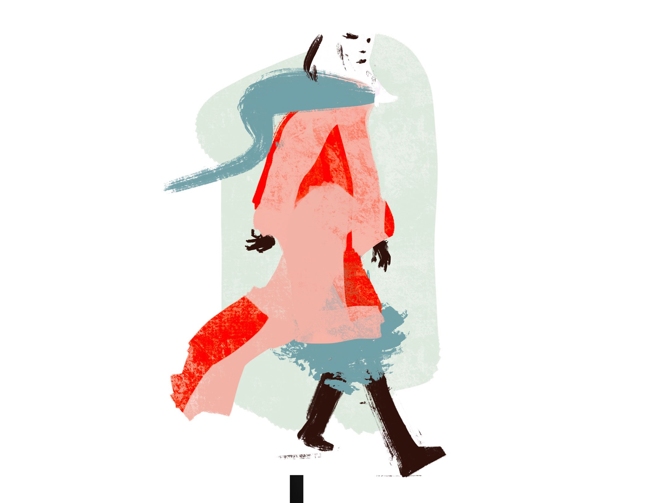
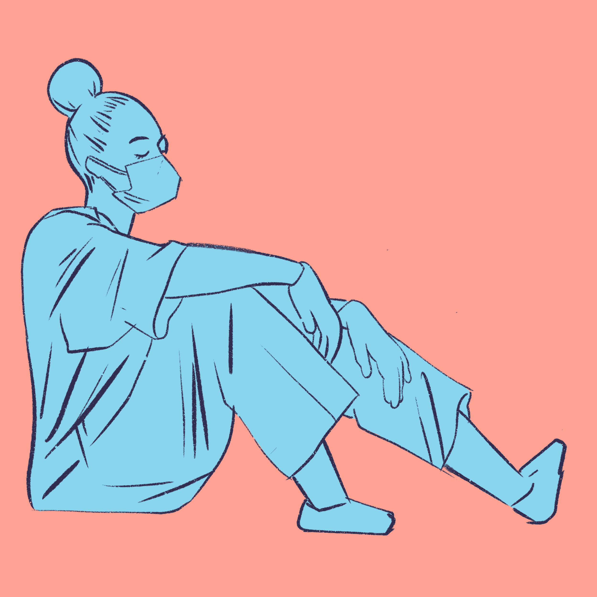
Illustration
Commercial & personal